Leading it rather than drawing it: SEU
The site for Georgian National University SEU — where the design problem was mostly a question of who gets to decide.


A university website is not one product. It is a dozen departments sharing one address.
Admissions wants applicants. Faculties want their programmes visible. Research wants publications. Career services, the library, the tech centre, international relations, the affiliated hospital — each arrives with a legitimate claim on the homepage and a page count of their own.
The audiences are just as split. A Georgian school-leaver comparing universities, an Indian student choosing where to study medicine, a current student looking for the academic calendar, and a partner institution checking credibility all need different first screens.
Left unmanaged, that produces the familiar result: a site that is an org chart with a header on it, navigable by whoever already knows the structure.
The structure is the deliverable
On a site this size, the information architecture and the rules that protect it outlast every visual decision. Get that right and the interface has something to be consistent about.
My job here was not to draw the screens. It was to make sure the screens that got drawn were answering the same question.
I led this one rather than executing it — a UI designer did the interface work, with engineering, marketing and faculty stakeholders alongside. That changes what the work actually is.
Most of my hours went to deciding what the site is for, whose need wins when two departments want the same slot, and what the standard is — then reviewing against that standard rather than against taste. A designer who is given a clear rule produces better work than one who is given a redline.
Audience-led entry points on top of a departmental structure.
The top of the site addresses people by why they came — applicants, faculties, international relations, the MIT and EHL partnerships — while the full departmental tree stays available underneath for those who know what they are looking for.
The partnerships get the prominence they earn: for a Georgian university competing for students, an MIT or EHL affiliation is the strongest available proof, so it leads rather than sitting in an about page.
Entry by audience, not by department
Applicants, faculties, international, partnerships across the top.
Nobody arrives thinking 'I need the Industrial Collaboration and Career Development Department'. They arrive as a school-leaver or a parent or a prospective partner, and the first row of the site says so in those terms.
One structure, held
A published pattern for section, listing and article — and a review against it.
The value of a lead on a project this size is refusing exceptions. Every department has a reason why theirs is special; a written structure turns that from a negotiation into a decision that was already made.
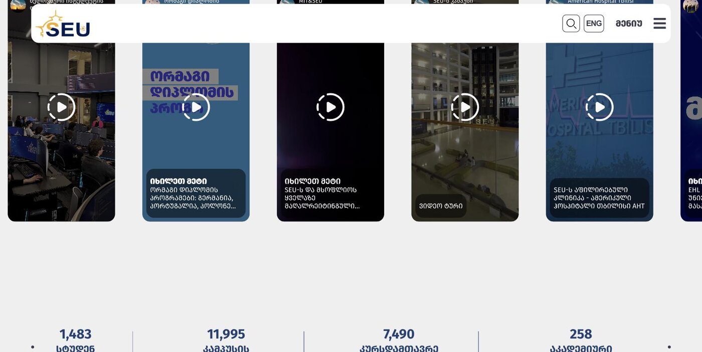
Proof over adjectives
MIT, EHL, GWU, the affiliated hospital, named students.
Universities describe themselves in superlatives that all sound identical. Named partners, real student testimony and the campus itself do the persuading that the copy cannot.
A news stream that does not swamp the site
Announcements and news given their own rhythm.
A university publishes constantly — conferences, competitions, deadlines. Containing that flow in its own patterns keeps the permanent content from being pushed under it every week.
A site the university can keep adding to.
SEU runs at seu.edu.ge in Georgian and English, covering admissions, faculties, research, student life and the international partnerships, with a continuous announcements and news stream on top.
New programmes, partners and departments drop into the existing patterns — which was the point of spending the time on structure rather than on screens.
What I would keep from this one
This is the clearest example I have of design leadership being a different job from design. I did not produce the UI here, and the project was better for it — my contribution was the brief, the structure, the standard and the review.
The hardest part was not visual. It was telling a department that their section would not lead the homepage, and having a reason good enough that the answer held.