A university runs on a handful of rules, and the student is the last person to be told what they are.
Course registration is the sharpest example. A student has a credit ceiling for the semester, a programme that divides those credits between compulsory, elective and research components, prerequisites that silently disqualify half the catalogue, and a registration window that opens at a fixed hour and closes when the groups fill.
Before the portal, all of that lived in the registrar's office: printed programme sheets, a queue in a corridor, and a member of staff doing arithmetic on the student's behalf. Everyone involved was doing manual work that the rules could do themselves.
The rest of the account had the same shape. Books, contracts, surveys, decrees, finances and the timetable each had their own custodian, their own form, and no single place where a student could see their own standing.
Everything happens in one week
Registration is not steady traffic. The entire student body arrives inside a few hours, mostly on a phone, mostly anxious, and mostly making a decision they cannot easily undo. That is the load the interface has to be designed for.
Students were not asking for more information. They were asking whether they were allowed to press the button.
Every question at the registrar's window reduced to one of three: how many credits do I still have, am I eligible for this course, and did my choice actually save.
So the portal answers those three continuously rather than on request. The credit budget sits in the header on every tab, eligibility is attached to each row rather than buried in a regulation, and every selection resolves to a visible state instead of a silent success.
One account, one table, and the rules stated where the decision is made.
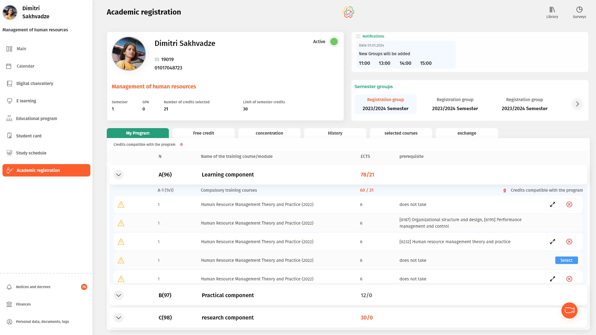
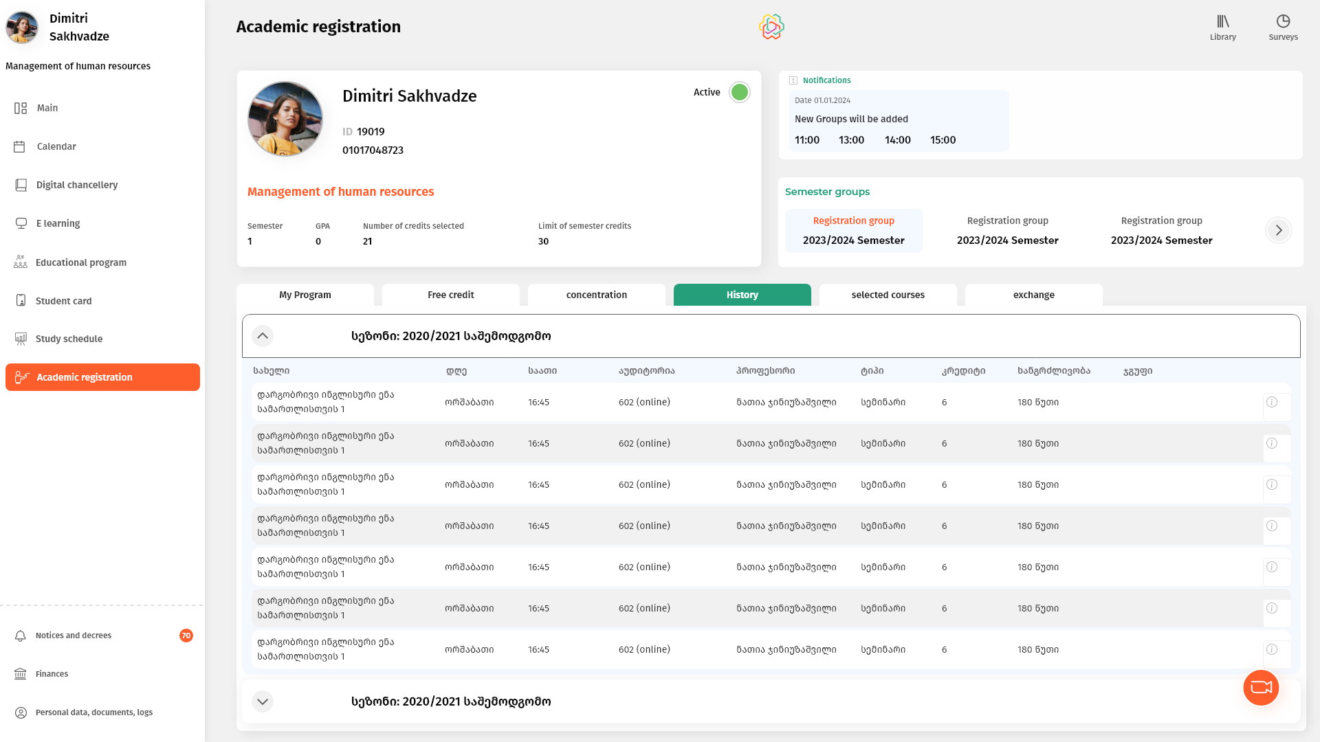
The student card at the top carries identity and standing together — programme, status, semester, GPA, credits selected against the credit limit — and it does not move when you change tabs. Registration is a budgeting exercise, so the budget is always on screen.
Underneath it, everything a student does with courses is the same table seen through different filters: their own programme, free credits, concentration, history, what they have already chosen, and the exchange market for swapping a group. Learning the table once is enough to use all six.
The credit budget is a fixed frame, not a screen
Selected against limit, visible on every tab.
Twenty-one of thirty is the only number that matters during registration, and it changes with every click. Keeping it in the header — outside the tabs, above the scroll — means a student never has to leave what they are doing to find out where they stand.
The programme components carry the same idea one level down: each block shows what it requires against what has been chosen, so an under-filled research component is visible before the window closes rather than after.
Eligibility on the row, not in the regulations
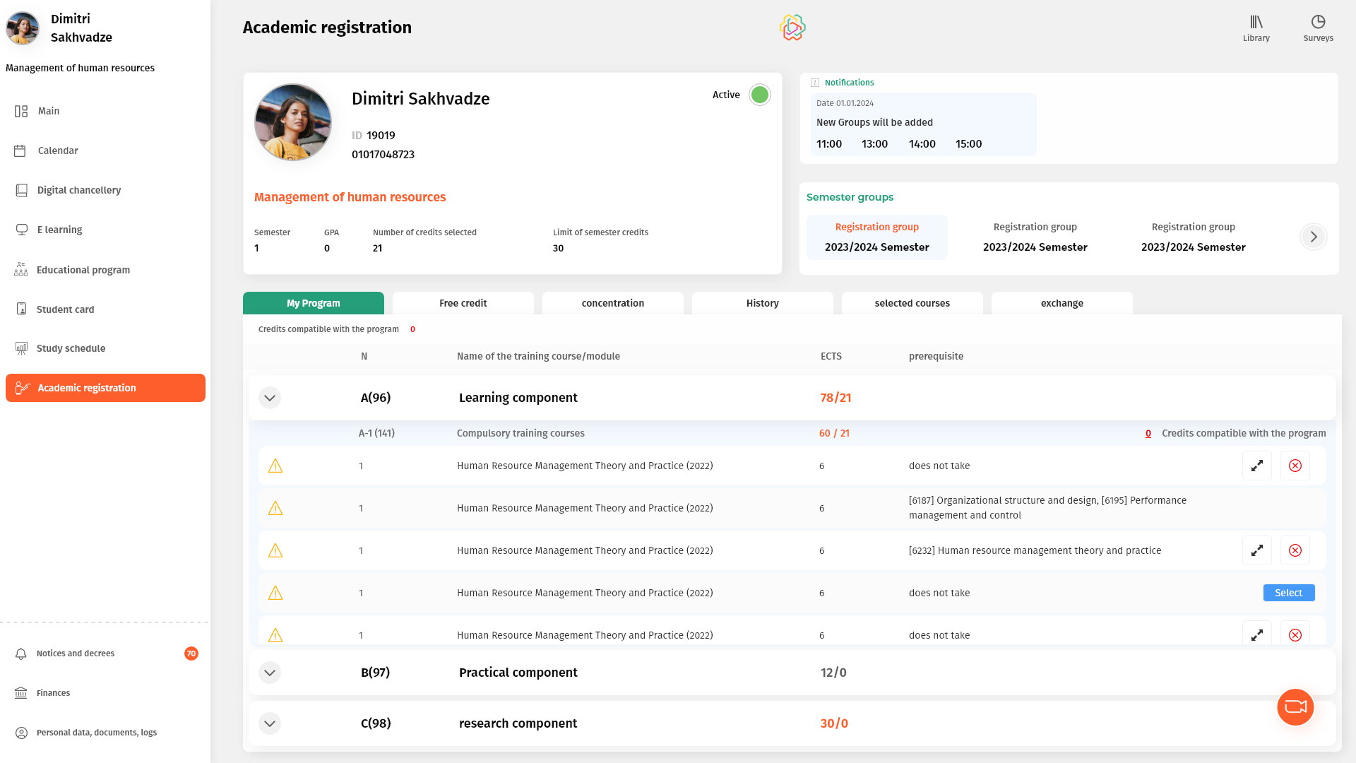
Prerequisites next to the course, and a plain list of what was committed to.
Each course states its own prerequisite in plain text beside it, and a flag marks the rows a student cannot take yet. The alternative — a rule published somewhere else — makes the student the integration layer between a PDF and a form.
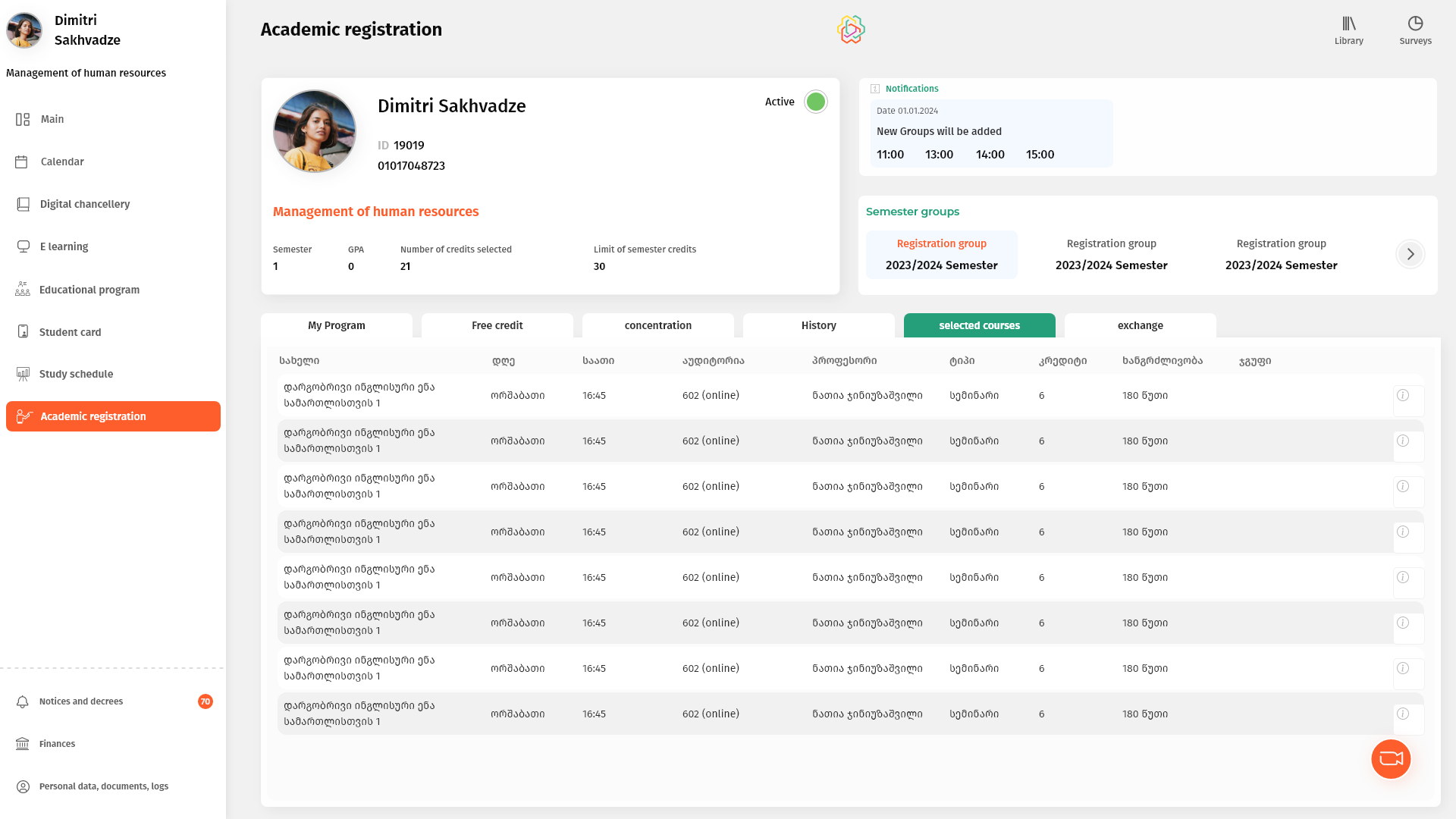
The action follows the same logic: an eligible course offers Select, an already-chosen one offers removal, and nothing offers an action it will refuse to complete. Selected courses then repeats back the timetable a student has actually built — day, hour, room, professor — because a registration confirmed only as a credit total is not a confirmation.
Group exchange as a market, not a request form
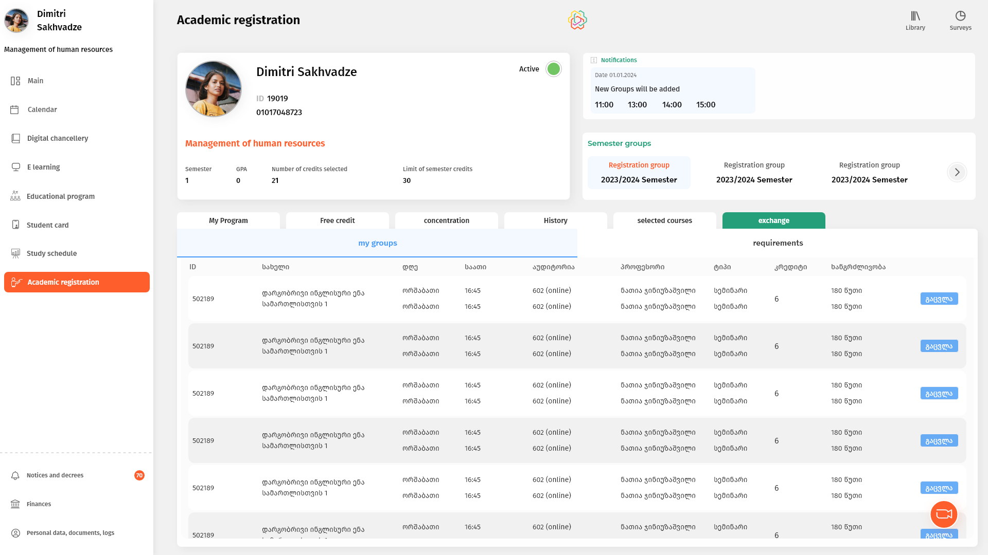
My groups on the left, requirements on the right.
Timetable clashes are usually solved by two students who each want what the other has. Splitting the screen into what you hold and what you have asked for turns a support ticket into a transaction the students can settle themselves.
The empty state matters more than the full one here: most students open this tab with nothing pending, so it has to explain what the tab is for rather than look broken.
History that stays folded until asked
One collapsed row per season, expanding into the full record.
A master's student accumulates a dozen semesters of groups, professors and grades. Presented as one long table it is unreadable; presented as seasons it is a list of eight things, any of which opens into detail.
The same accordion carries the programme components on the registration tab, so expansion means the same thing everywhere in the product.
The library is a catalogue with a shelf attached
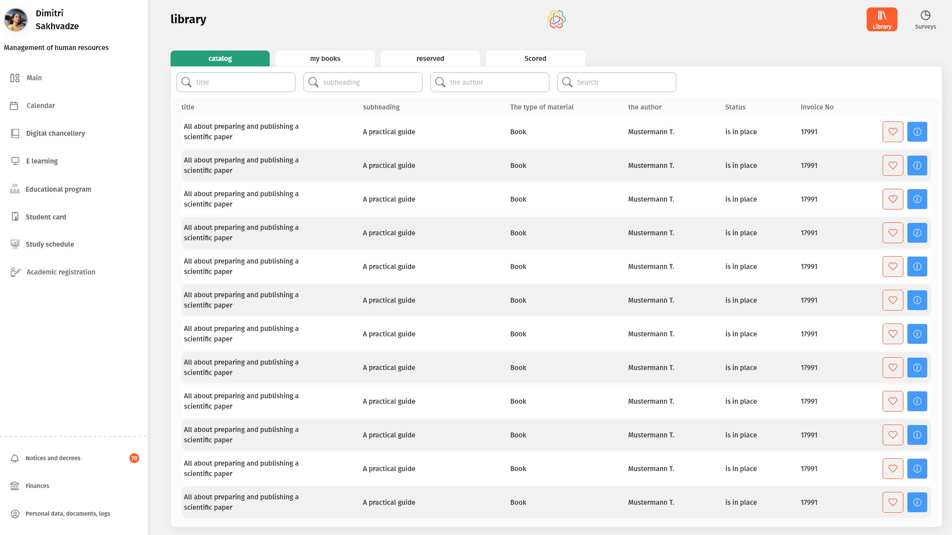
Catalogue, my books, reserved and returned — one table, four states.
A book is either available, on your shelf, waiting for you, or back with the library. Those are states of one record rather than four separate features, so they are four tabs over the same columns and the same search.
The full bibliographic record — contents, ISBN, UDC, publisher, pages — opens in a side panel rather than a new page, because a student comparing three books should not lose the list to look at one of them.
Surveys asked one page at a time
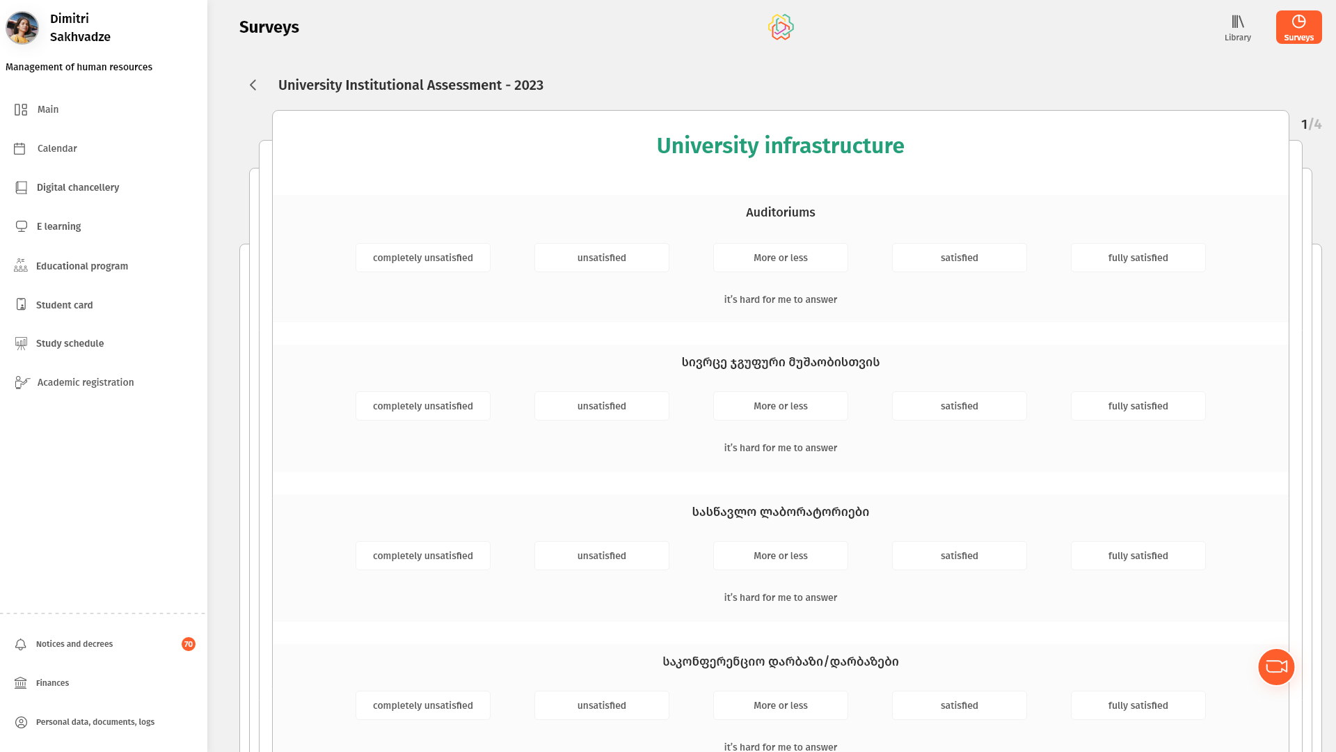
A stack of cards, a scale that reads left to right, and a visible 1 / 4.
Institutional evaluation only produces useful data if students finish it. Showing the whole questionnaire at once guarantees they will not, so it is dealt in pages with the remaining depth visible behind the current card.
Every scale keeps the same direction and the same 'hard to answer' escape, so a student who disengages leaves a gap rather than a random answer.
The registrar's desk, moved into the student's account.
Registration, course exchange, academic history, the library, institutional surveys, documents, contracts, finances and notices now sit behind one login, sharing one navigation and one set of table and state patterns.
The work that used to be a queue at a counter is now a decision a student makes for themselves, inside the constraints of their own programme, with the rules visible at the point where they apply.
What I would keep from this one
Administrative software is mostly the transcription of rules, and the temptation is to transcribe them into help text. Nearly everything good here came from moving a rule onto the object it constrains — the credit ceiling into the header, the prerequisite onto the row, the deadline into the notification.
The part I would push harder on is the empty and error states. 'Progress will be lost' and 'the programme does not provide for a concentration' are the moments a student is most likely to give up, and they deserved as much attention as the tables did.