Every screen a student sees has a member of staff on the other end of it.
The student portal is the visible half of the system. The half that keeps it true is this one: a register where the university's whole student body lives, and where admissions, the registrar, quality assurance, HR, finance, the library and the chancellery all edit the same record for different reasons.
That record is not small. One student carries personal and parental data, educational history, orders, a student card of every semester taken, credit recognition from a previous institution, mobility decisions, documents, contracts, statements, notices, insurance, research, logs and a diploma supplement.
The failure mode of software like this is well known: each department gets its own screen, the same field is entered three times, and nobody can say which copy is correct.
One record, many editors
The design problem was not making the data visible. It was making it obvious who owns which part of a record that a dozen roles can write to.
Administrative staff do not browse. They arrive with a student in mind and a decision to make about them.
Nobody opens this system to look around. Somebody has come to the window, or an email has arrived, and a specific person's record has to be found, checked and changed within a couple of minutes.
So the product is built around one shape: find the student, open the student, and everything the university knows about them is a list on the left. Whatever the department, the route is identical — which is what makes the system learnable by someone who only uses two of its thirty sections.
Find, open, and work down a single spine.
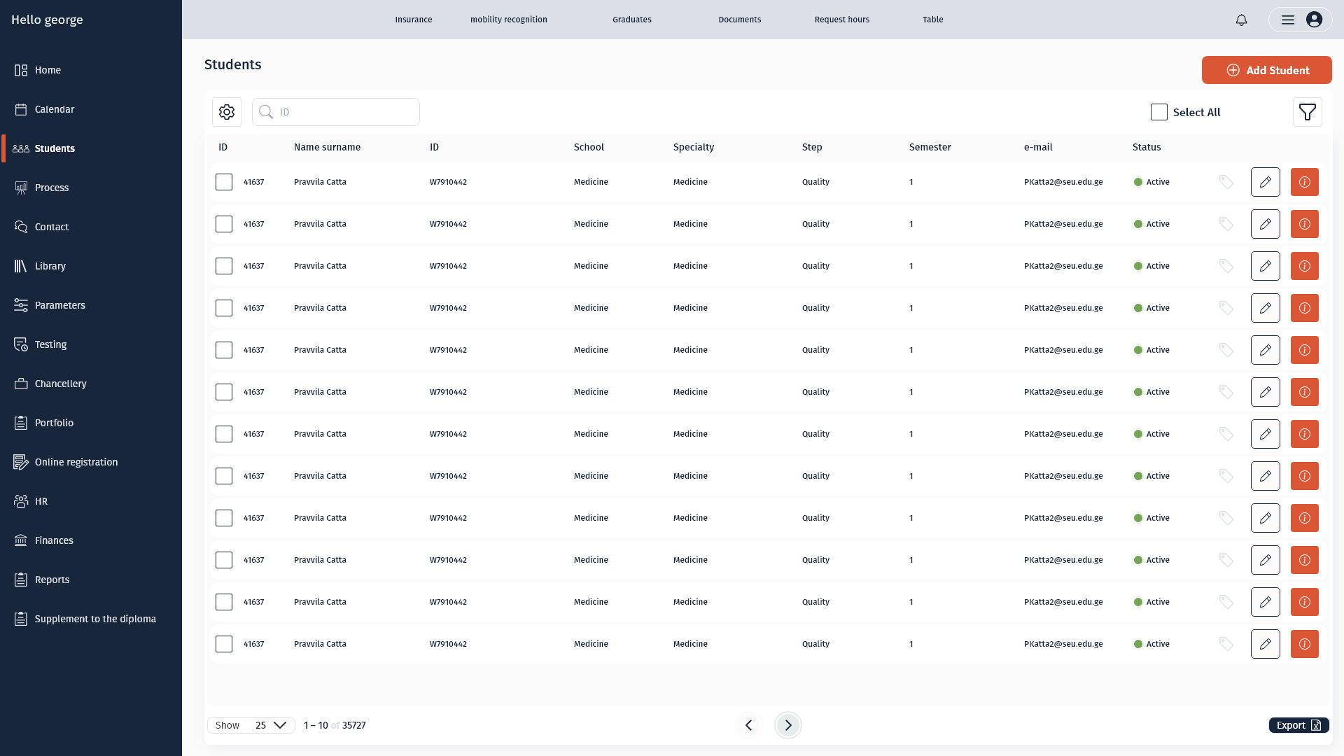
The register is the front door: search by ID, filter, select, act in bulk, export. The columns are the ones staff actually identify a student by — ID, name, school, speciality, step, semester, status — not everything the database happens to hold.
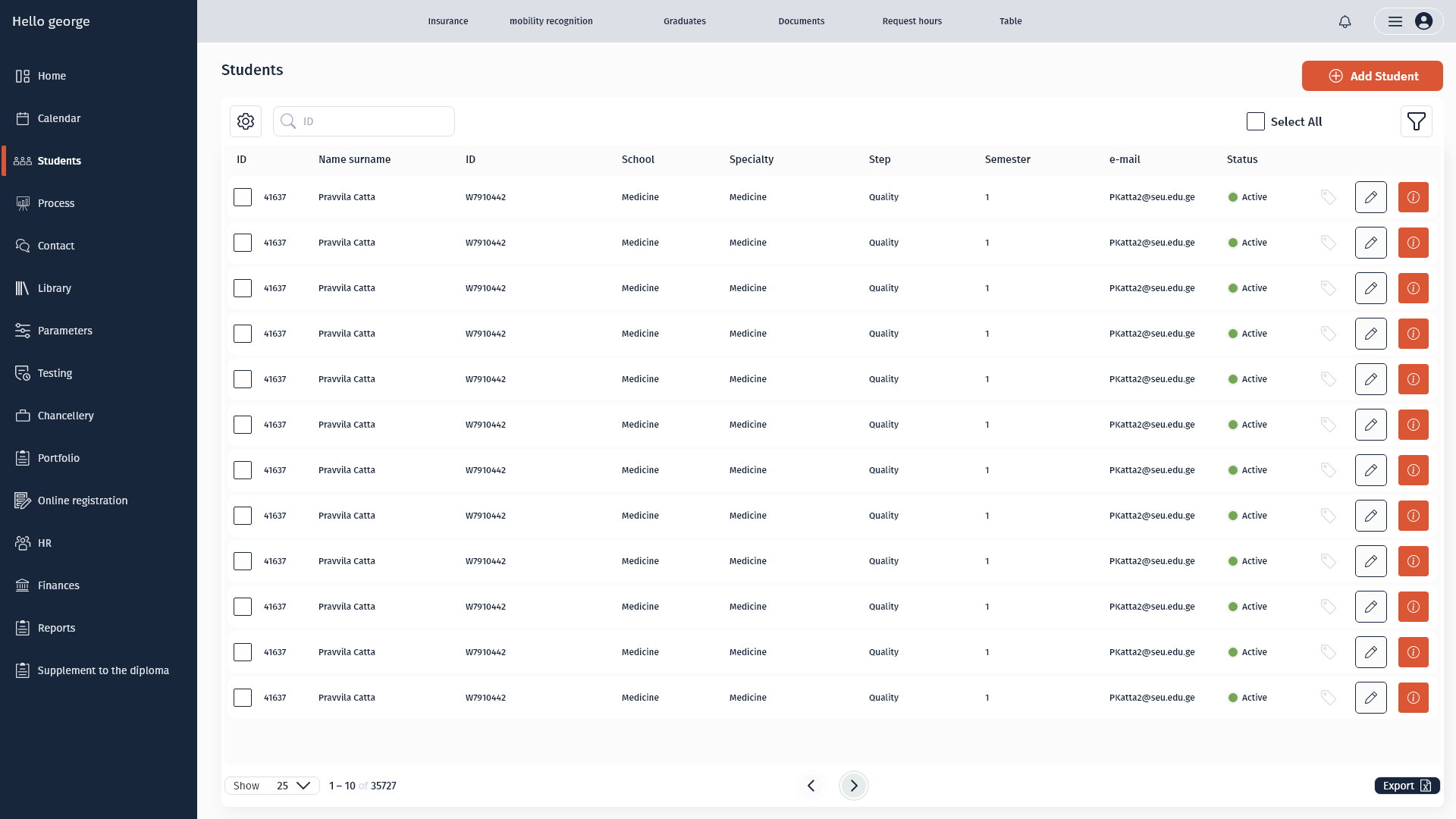
Opening a student replaces the page with a fixed identity header and a section rail. The header carries the facts that change how a case is handled — registration status, grant percentage, priority, refugee, medallist, underage — so a member of staff is never one click away from the context that should change their decision.
A register built for finding one person
Search, filter, bulk select, export — and columns staff recognise.
The table is sorted, paginated and exportable because half the requests that reach a registrar end in a spreadsheet for somebody else. Making export a first-class action removed a whole category of manual work.
Row actions are limited to edit and detail. Everything more consequential happens inside the student, where the full context is on screen — bulk operations on a list are how records get damaged.
The identity header never leaves
Status, grant, priority, underage and the record's QR pinned above every section.
Thirty sections, one context. Whether a member of staff is editing insurance or a diploma supplement, they can see that this student is a minor, on a ninety-percent grant and currently registered — the flags that most often change what is allowed.
Personal data itself is the longest form in the product, so it is broken into named blocks — name, personal, parental, contact, additional — rather than one column of fields. Verification and two-factor state sit at the end, where the record is confirmed rather than entered.
Actions on the row they belong to
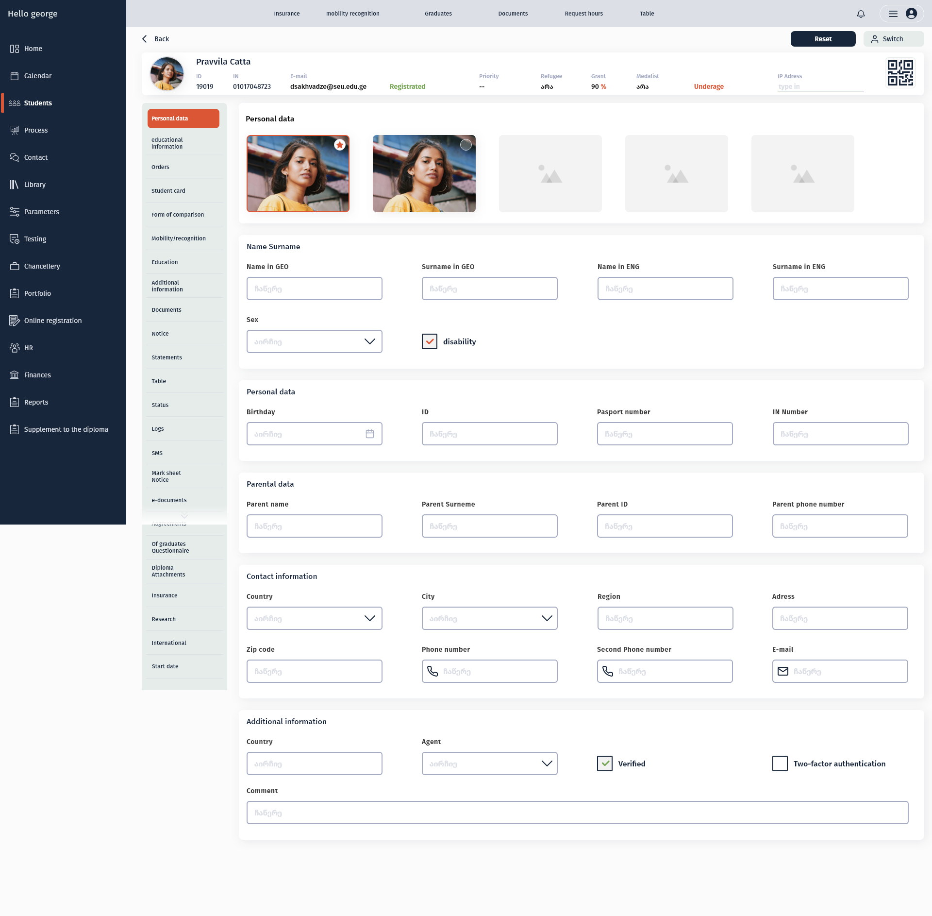
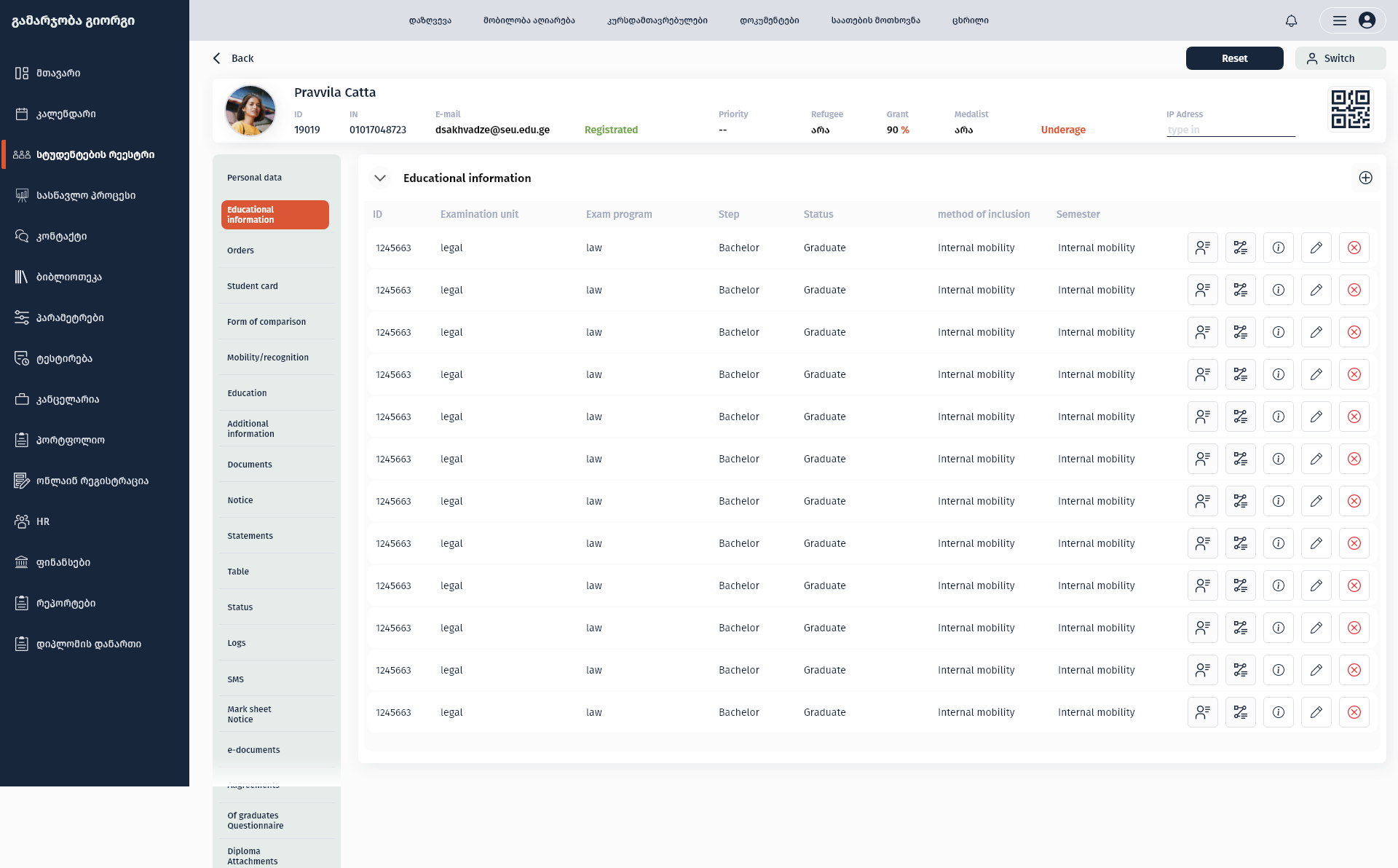
Assign, transfer, inspect, edit, remove — at the end of each line.
A student's educational information is a set of enrolments, each with its own status, step and method of inclusion, and each needing a different action. Putting those actions on the row keeps a decision attached to the thing it is about.
Destructive actions keep one colour and one position everywhere in the product, so the muscle memory of a daily user never lands on the wrong control.
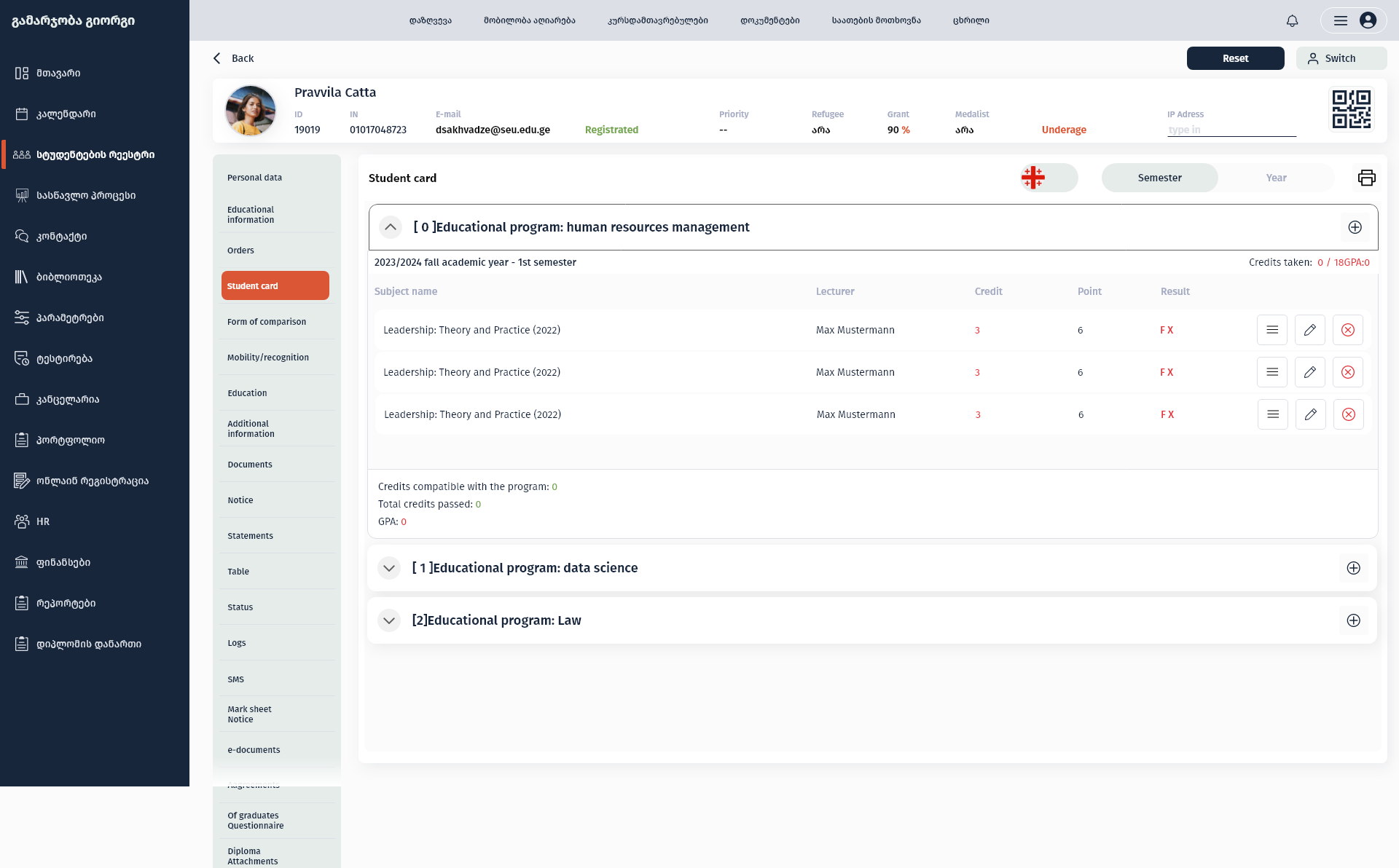
The academic record folded by semester
One accordion per programme and season, with credits and GPA on the fold.
The student card is the document staff are asked about most, and it is naturally hierarchical: programme, then academic year and semester, then subjects with lecturer, credits, points and result. The summary a caller usually wants — credits taken and GPA — sits on the closed row.
A student with more than one programme gets one block per programme rather than a merged list, because merging them is exactly the mistake the paper version used to make.
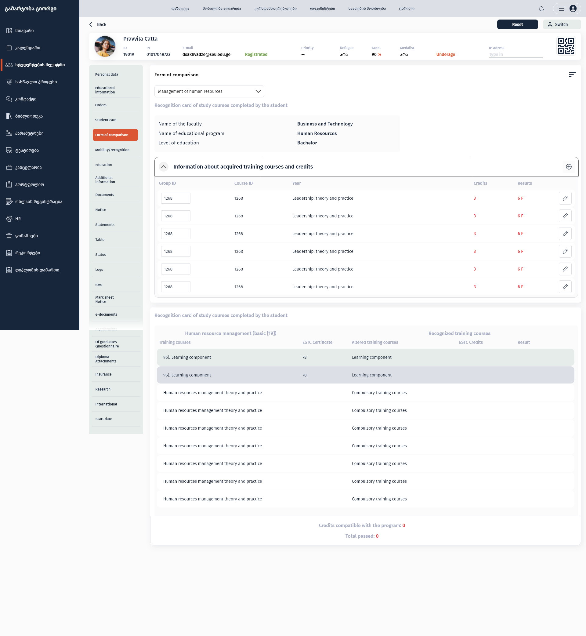
Recognition shown as a comparison
What was studied elsewhere on the left, what it counts for here on the right.
Credit recognition is an argument about equivalence, so the screen is built as two columns: the courses and credits a student brings, and the courses in this programme they are being mapped onto, with the totals resolved underneath.
The alternative — two separate tables and a staff member holding the mapping in their head — is where recognition decisions actually go wrong.
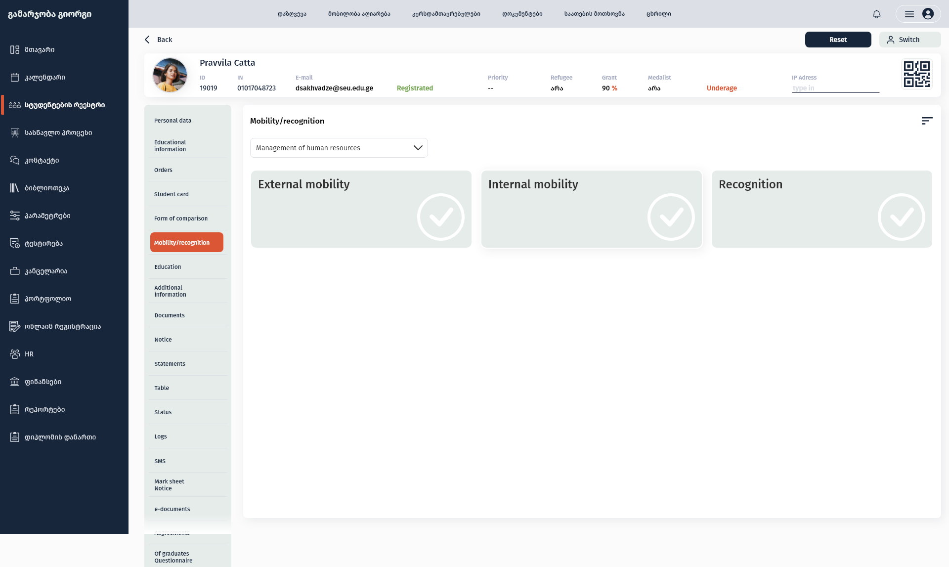
Status before detail
External mobility, internal mobility and recognition as three states, not three forms.
Most of the time a member of staff only needs to know whether a process is finished. Three large cards answer that in one look, and the detail is one level down for the cases that are not.
It also gives the section an honest empty state: a process that has not started reads as not started, rather than as an empty table that looks broken.
One record, one route to it, and a system a new hire can be shown in an afternoon.
Admissions, the registrar, quality assurance, HR, finance, the library and the chancellery now work on the same student record through the same register, the same identity header and the same section rail.
Because the staff console and the student portal are two views of one system, what a student sees in their account is what the registrar sees in theirs — which removes the reconciliation work that used to sit between them.
What I would keep from this one
Internal software is judged by how it behaves on a bad day: a queue at the window, a deadline, a record that is not quite right. Almost every decision here was made for that day rather than for the demo.
The lesson I keep from it is that consistency is a feature in administrative tools in a way it is not elsewhere. Thirty sections that behave identically are worth more than five sections individually optimised.