Home / AI Lab

Built with AI. Shipped anyway.

A designer who can build changes what is worth proposing. These are the ones that made it to a URL — with the parts that fought back written down.

18 builds
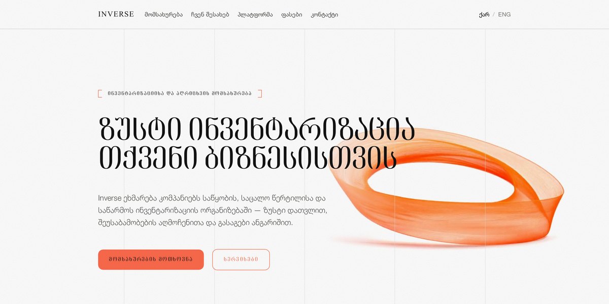
Inverse — screenshot

InverseIn progress

B2B services + platform

A Tbilisi stocktaking firm, and the tool its own counters use. A worker photographs a shelf, the system reads the still, counts what it can see per SKU and says how sure it is — then a person decides.

Next.jsMulti-tenant DBVision on stillsClaudeVision
6 notes
  • In progress — the marketing site and the platform pages are standing; the tool itself is being built and the pricing is marked as awaiting commercial sign-off rather than quietly presented as final.
  • The verification runs on a still frame, not a live stream. A frame is the thing that gets stored, re-checked and shown to an auditor months later; a stream is gone the moment it plays. For a count that has to be defensible, evidence beats immediacy.
  • Every SKU gets a verdict rather than a guess: green matches, yellow needs a human, red means the record is wrong. Nothing reaches the ledger without a person confirming it — an inventory system that silently writes its own numbers is a liability, not a feature.
  • The interesting part is where the camera is admitted to be useless. Two products from one line are identical at a metre and differ only in size, so those get flagged for a barcode check with the likely candidates named. Saying ‘I cannot tell these apart’ is worth more than a confident wrong count.
  • Tenants are isolated at the database level rather than by code that might forget a filter. With client stock figures, that is the difference between an architecture and a hope.
  • Written in Georgian first, with English and Russian alongside — the buyers are warehouse and retail managers in Tbilisi.
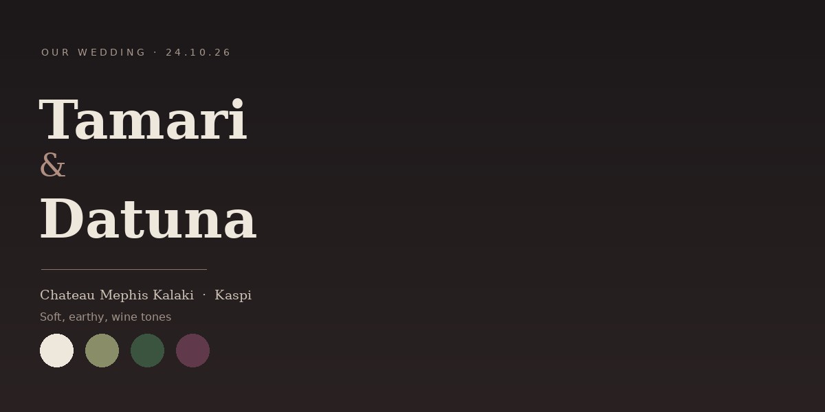
Tamari & Datuna — screenshot

Tamari & Datuna

Invitation

A wedding invitation as a site rather than a card — countdown, order of the day, map, dress code and RSVP, in three languages, written in the couple’s own voice rather than in invitation language.

Next.jsScroll-driven videoGreat Vibes + body pairClaude
4 notes
  • The copy is the whole thing. ‘Nobody dare stay away, and do not even think about it’ is how these two actually talk, and it does more work than any amount of gold foil would — a guest reads one line and knows exactly what kind of evening this will be.
  • A paper invitation answers four questions and stops. A page can carry the schedule, the address that opens in maps, the dress code and the RSVP — which means nobody has to text the couple in the week before the wedding to ask what time the signing is.
  • Three languages, because the guest list is. Georgian, English and Russian side by side rather than one translated afterthought.
  • The dress code is given as colours — ivory, olive, deep green, plum — not as a rule. It is easier to follow and it doubles as the site’s palette, so the invitation looks like the room it is inviting you to.
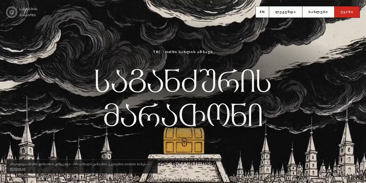
საგანძურის მარათონი — Treasure Marathon — screenshot

საგანძურის მარათონი — Treasure Marathon

Campaign concept

A campaign concept for TBC that turns four money habits into four noble houses. A treasure shatters into coins across the kingdom, the houses race to collect them, and a quiz tells you which one you have been all along.

Next.jsTailwindScroll-driven sectionsClaudeAI video
5 notes
  • Banks talk about saving and spending in the language of product features, which nobody adopts as an identity. Houses people do adopt. Kharjiani spends because life happens once, Anabaridze insures the future, Dovlatia chases luck, Baratishvili keeps the old order — four financial behaviours, none of them written as the wrong answer.
  • That last part is the constraint the whole thing is built on. The moment one house is the sensible one, the quiz becomes a scolding and the campaign becomes a lecture. Every motto had to be defensible from inside the house.
  • The leaderboard is what turns a personality quiz into a season: your result stops being a private label and becomes a side you are adding a coin to. It is placeholder data here, but the mechanic is the point — a bank campaign that has standings has a reason to be checked twice.
  • Written in Georgian first, with the English house names underneath rather than the other way round. A myth told in translation is somebody else’s myth.
  • The whole arc is three scroll acts — prologue, the night it shattered, the marathon — before a single house appears. Front-loading the story is what earns the quiz at the end; leading with ‘take our quiz’ would have got the usual answer.
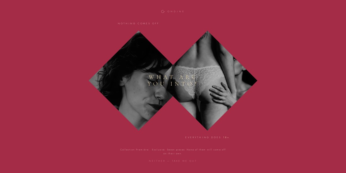
Maison Ondine — screenshot

Maison Ondine

Lingerie e-commerce

A lingerie house where the shop mechanics are the product. Hold-to-reveal instead of an age-gate button, motion backgrounds behind the collection, and a score written for the site rather than licensed onto it — the video and the music are both mine, made with AI tools.

HTML + CSSVanilla JSScroll-driven videoClaudeAI video + music
5 notes
  • Still in progress — the gate, the identity, the score and Collection Première are standing; the rest of the shop is being built.
  • Lingerie sells badly in a normal product grid: a flat thumbnail on white tells you nothing about how a piece moves or sits. So the browsing mechanic is built on motion — video behind the collection rather than stills in a matrix, which is the one thing a photograph cannot do.
  • Compliance screens are usually designed by nobody. This one is the brief: hold to reveal, so entry is a deliberate physical action instead of a mis-tapped button, and the tone is set before a single product appears.
  • I wrote the music with an AI tool rather than licensing a track. A stock loop makes any brand sound like every other brand — and for a house whose whole proposition is intimacy, borrowed atmosphere is exactly the wrong signal. Same reasoning for the video: generated to the brand, not bought off a shelf.
  • Sound is offered, never autoplayed. On a site like this it is the one element that can genuinely embarrass someone, so it stays a choice — which also means the score has to earn the tap.
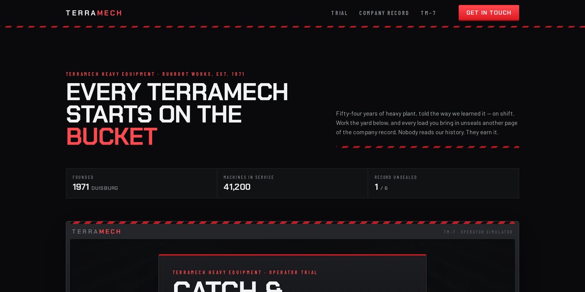
TerraMech — screenshot

TerraMech

Brand site

A site for a fictional heavy-plant maker whose company history is locked. You run an arcade shift on the yard — catch the loads, keep hazards out of the bucket — and your salvage total unseals the six pages of the record one at a time.

HTML + CSSVanilla JSCanvas game loopClaude
4 notes
  • The premise is one inversion of a normal About page: nobody reads a company timeline, so the timeline is earned. Six entries, most of them sealed, opening as the score rises — the copy even says it out loud: ‘Nobody reads our history. They earn it.’
  • Because the history is the reward, the writing had to be worth unlocking. Each entry is a real turn in how a machine company would change — the first rebuilt dragline, the day everything got painted signal red because it was the only paint the yard held in quantity.
  • The game is deliberately simple — one axis, mouse or arrows, three power-ups. Anything more and people would play instead of read, which would defeat the point of the mechanic.
  • It is a fictional client, which is the freedom: no brand guidelines to satisfy, so every decision had to be justified by the idea alone.
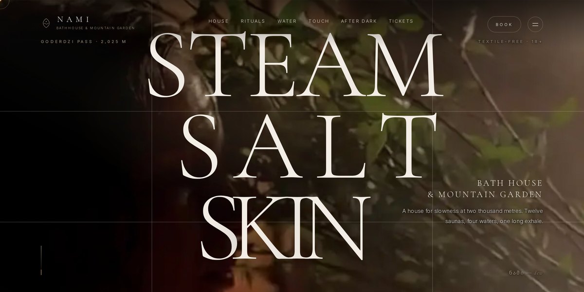
NAMI — screenshot

NAMI

Hospitality

A bathhouse and mountain garden at 2,025 m on the Goderdzi Pass — twelve saunas, four waters and a ritual timetable where something begins every half hour. Georgian-rooted, written to be read slowly.

HTML + CSSVanilla JSScroll-driven animationClaude
4 notes
  • ნამი means dew, and the whole identity comes from that one word: a serif set at whisper weight, brass on near-black, and a mark that is a single drop. Naming the brand in Georgian first made every other decision easier.
  • The hard part of a spa site is that the product is an absence — no noise, no hurry, nothing to do. So the specifics carry it instead: eight degrees chest deep for thirty seconds, Black Sea salt carried up from Batumi, nine hundred candles lit at dusk.
  • The ritual timetable is the structure rather than a feature list. ‘Every half hour, something begins’ turns a menu of services into a reason to stay, which is what the business actually sells.
  • Pacing is done with scroll rather than motion. Long holds, wide measure, very little movement — a site about slowness that animates eagerly would be arguing with itself.
Chalet — screenshot

Chalet

Marketing site

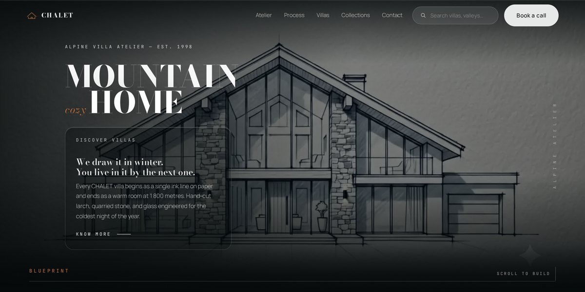
A landing page for a fictional alpine villa atelier, built around one idea: the hero is an ink blueprint of a chalet that draws itself in as you scroll. Fourteen sections, a build sequence from survey to first fire, and a preloader that says ‘drawing the blueprint’.

HTML + CSSVanilla JSCanvasClaude
4 notes
  • The whole site hangs off one metaphor. ‘Scroll to build’ in the hero and a BLUEPRINT progress rail along the bottom mean the scrollbar is reframed as construction — and the five process sections (survey, structure, stone, envelope, keys) inherit that reading without needing to explain it.
  • Copy did more for the tone than any effect. ‘We draw it in winter. You live in it by the next one’ and ‘cozy is an engineering decision’ set a register that the visuals then only have to keep, which is much easier than generating atmosphere from motion alone.
  • The hero is a canvas, not an image, so it scales without a 4MB render and the line work stays crisp at any width. That was the right call for a drawing and would have been the wrong one for a photograph.
  • It is a fictional client, which is the point — no brand guidelines, no stakeholder, so every decision had to be justified by the idea alone.
GA Logistics — screenshot

GA Logistics

Redesign

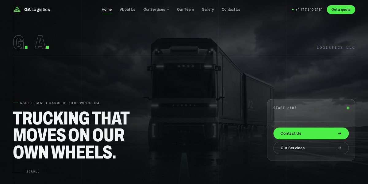
A redesign for a New Jersey trucking carrier — 200 power units, 48 states, eight services and one dispatch desk. The brief was not to make a haulage company look like a tech startup, but to make ten years of real capacity legible to a broker deciding in thirty seconds.

Static siteVideo heroHorizontal scrollClaudeCode generation
4 notes
  • Freight buyers are checking one thing: can you actually move this. So the numbers lead — ten years, two hundred power units, forty-eight states, 24/7 dispatch — and the strongest line on the site is the one that says what those numbers mean: when we commit to a load, the truck exists.
  • Eight services is too many for a menu and exactly right for a sideways scroll. Turning the range into something you move through rather than read down let each one keep a full card without the page becoming a list of eight identical blocks.
  • The copy does the differentiating, not the layout. ‘Asset-based carrier’, ‘founded by drivers with 7 and 14 years on the road’, ‘the people answering the phone at 3am’ — in a market where every competitor claims reliability, the specific thing is the only convincing thing.
  • Two yards and a dark, photographic treatment do the rest. Trucking sites default to blue gradients and stock highways; shooting the actual fleet against near-black is both more honest and, for once, cheaper.
IBSU — International Admission — screenshot

IBSU — International Admission

Concept

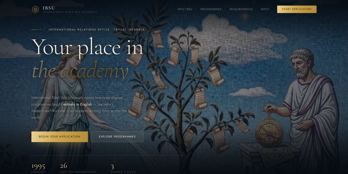
A fourth answer to the IBSU brief, this time for the students arriving from abroad: twenty-six English-taught degrees, the documents you have to notarise, and the five steps between an enquiry and a residence permit.

Scroll narrativeMosaic imageryWebClaudeGenerative imagery
4 notes
  • International admission is an anxiety problem before it is a marketing one. Somebody deciding to move countries needs to know what to send, what it costs and what happens next — so the page is structured as requirements and steps rather than as reasons to come.
  • The one detail that mattered most is repeated where it applies: every document must be notarised and translated into Georgian. That single sentence is the difference between an application that proceeds and one that comes back, and it is usually buried in a PDF.
  • The classical staging — Roman numerals, a mosaic that shifts as you scroll, a golden road for the five steps — gives an ordinary admissions page the weight of an institution. It is the same argument as the marble concept, made for a different reader.
  • It closes on the International Relations Office rather than on a form, with a footnote telling applicants to verify tuition and deadlines before submitting. A concept page about someone’s visa should not pretend to be authoritative about their visa.
Syniotec — Devices — screenshot

Syniotec — Devices

Product site

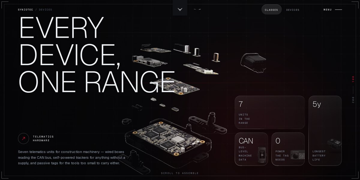
A showroom for seven telematics units that go on construction machinery — wired boxes reading the CAN bus, self-powered trackers, and passive tags with no battery at all. The hardware counterpart to the Syniotec platform I design, built as a scroll narrative where the exploded parts assemble as you read.

Next.jsStatic exportScroll-driven render sequenceClaudeCode generation
5 notes
  • Seven SKUs is past the number anybody can hold in their head, so the range is presented as three classes first — wired, powered, passive — and only then as seven units. The classification is the product decision; the grid underneath is just the consequence.
  • The exploded board assembling on scroll is the argument, not the decoration. It says these are one range built from the same parts, which is the claim a hardware line has to make before any single spec matters.
  • Every unit gets one sentence and then the numbers that back it. ‘Reads the machine, not just the map.’ ‘Five years without a thought.’ ‘No battery. No radio. Still tracked.’ A spec sheet nobody reads becomes a spec sheet somebody remembers when each device is allowed a position rather than a paragraph.
  • The footer states what the site refuses to be: hardware only, no pricing, no forms. A showroom that does not chase you is a stronger sales tool for equipment bought by engineers than one that does — and it is the reason the whole thing could stay this quiet.
  • It pairs with the SAM and RAM platforms in my work section: these are the devices sending the data those interfaces spend their time making legible. Designing both ends of the same system is rarer than it should be, and it changes what you notice at each end.
ClassyGreens — screenshot

ClassyGreens

AI-operated

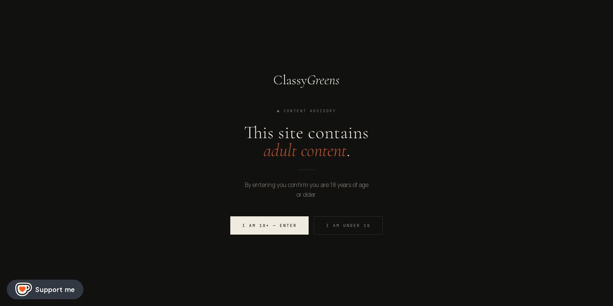
A visual atelier that runs itself. Every image, every film, every line of copy and the site around them are generated — and the publishing keeps going week after week without a photographer, a studio or a shoot day. The closest thing I have to a proof that an entire brand can be operated by one person and a set of models.

Sanity CMSStructured contentTrilingual DE / EN / RUImage generationVideo generation
6 notes
  • This is the part that interests me: it is not a one-off generated site, it is a production line. A new series is generated, written, translated, tagged and published on a weekly rhythm — so the question stopped being 'can AI make an image' and became 'can AI hold a publishing schedule'. It can, but only because the content is modelled properly first.
  • Nothing is a page. Projects, models and journal entries are structured records in a CMS, which is why one generated series can fan out into a project page, a model's history, a listing card, an Instagram crop and its own metadata without anyone assembling those by hand.
  • Models are treated as recurring characters rather than one-time outputs. Each has a profile and a project history, so the work accumulates into a body of work instead of a feed — that continuity is the hardest thing to get out of generative tooling and the thing that makes the brand feel like a studio.
  • SEO is generated with the work, not bolted on after: titles, descriptions and canonicals per record, in three languages, so every new series arrives already indexable. Volume is only an advantage if each item can be found on its own.
  • The interface earns its keep too. Premium frames are revealed by dragging across them like a scratch card, rationed to three a day — a deliberate friction that makes an infinite supply of images feel finite, which is the whole economic problem with generated work.
  • The disclosure is the position, not the small print. An 'AI' mark sits in the header, the footer says it plainly, and the front door is an 18+ advisory. Naming the tool is more interesting than hiding it — and the site is only as credible as the thing it admits to being.
IBSU — The Ink Gallery — screenshot

IBSU — The Ink Gallery

Playable

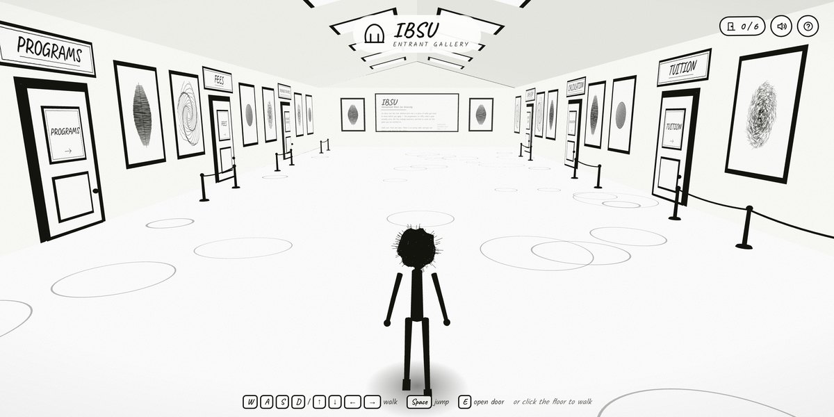
A university prospectus you walk through. An ink stickman crosses a hand-drawn hall lined with six doors — Programs, Fees, Admission, Tuition, Relocation, International — and pushing one open takes you to that part of IBSU admissions.

CanvasVanilla JSHand-drawn assetsClaudeGenerative imagery
4 notes
  • The third answer to the same IBSU brief, and the one that stops pretending to be a website. Navigation is a room: six doors instead of six nav links, and a counter that tells you how many you have opened.
  • Everything is ink on paper — the pen strokes carry the whole art direction, so there is no photography to source and nothing to look dated in two years.
  • Games have onboarding costs a website does not, so the controls are taught three ways at once: keyboard, an on-screen joystick, and simply clicking the floor. Clicking is the one nobody has to be told about.
  • Honest limitation: it takes about fifteen seconds to load and it asks for effort before it gives anything back. That is the right trade for a school-leaver browsing at midnight and the wrong one for a parent checking tuition — which is exactly why it sits beside two conventional proposals rather than replacing them.
khomeriki.design — screenshot

khomeriki.design

Portfolio

This site. A portfolio with no framework and no page builder — a Python script generates thirty static pages from one shell, and the motion runs on hand-written WebGL and GSAP.

Python generatorVanilla JSWebGLClaude
3 notes
  • The background is a GPU particle field. The reference implementation I started from advected 50,000 particles in a JavaScript loop; moving the whole simulation into a vertex shader dropped it to one draw call and 12KB, instead of the 600KB three.js would have cost.
  • Every page comes from one build script, so the nav, footer and meta can never drift apart. Editing content means editing a Python list.
  • Vibe coding gets you to a running thing fast, then the real work starts: most of the time here went on contrast, layout drift and cache headers — the parts a demo never has to survive.
IBSU — Entrant — screenshot

IBSU — Entrant

Concept

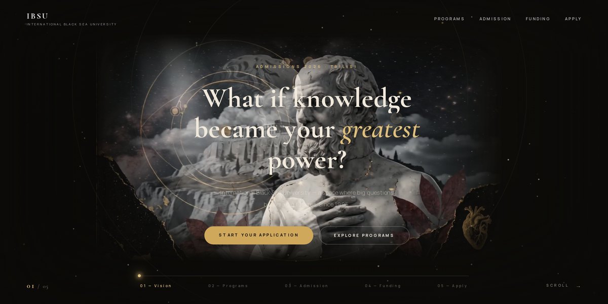
An admissions site aimed squarely at school-leavers rather than at the university. Five scroll chapters — Vision, Programs, Admission, Funding, Apply — that end on the Georgian national-exam steps, because that is the actual decision an applicant has to make.

Scroll narrativeComposite imageryWebClaudeGenerative imagery
3 notes
  • Universities usually sell themselves to parents. This one addresses the seventeen-year-old: one question in the hero, then the enrolment path in three concrete steps instead of a prospectus.
  • Classical sculpture composited into a dark, gilded field — an attempt at an academic institution that does not look like every other one.
  • The chapter rail doubles as a progress indicator, so the page tells you how much decision is left before you commit to reading it.
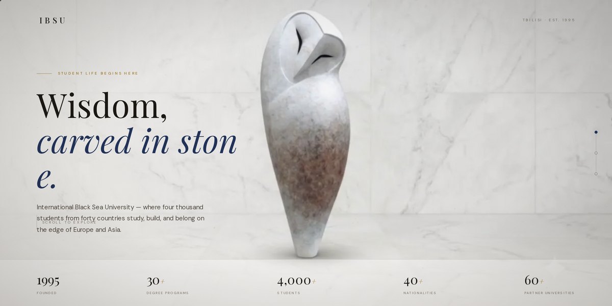
IBSU — Wisdom, carved in stone — screenshot

IBSU — Wisdom, carved in stone

Concept

The same brief taken the opposite way: marble instead of night, a serif voice, and the institution's numbers doing the talking. Built as a counter-proposal so the choice between the two was a decision rather than the first idea.

Editorial layoutSerif type systemWebClaudeGenerative imagery
3 notes
  • Two directions for one brief is the cheapest thing a designer can do and the one clients value most — it turns 'do you like it' into 'which one'.
  • Stone, owl and quiet gold do the institutional work that a stock photo of smiling students usually fails at.
  • Known issue: at some widths the hero headline breaks mid-word — 'carved in ston / e.' A word-break rule set too aggressively on the display type.
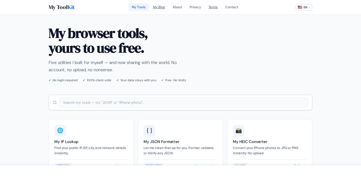
My ToolKit — screenshot

My ToolKit

AI-built · Ad-funded

Thirty-four browser utilities — JSON formatter, HEIC converter, PDF merge, hash generator, colour and contrast checker — every one of them running on the user's own device. Front end, tooling logic, copy, translations into nine languages and the SEO were all produced with AI; my job was deciding what to build and what the rules were.

Client-side JSCanvas & Web CryptoNine languagesClaudeCode generation
4 notes
  • The whole product is one promise: nothing is uploaded. HEIC decoding runs on the device's own graphics stack, hashes come from Web Crypto, PDFs are assembled in memory. That is not a privacy policy, it is an architecture — there is no upload endpoint to trust, because none was ever written.
  • Thirty-four tools is only viable because they share one shell: the same input panel, the same result block, the same copy and download actions. Generating the thirty-fifth is cheap; deciding it belongs is the part that still takes judgement.
  • Every tool ships with its own long-form explainer and FAQ, and the structured data is written so that search engines and assistants can quote the answer directly. When a chatbot is the front page, being quotable matters more than ranking.
  • The honest constraint: this is ad-funded, so the incentive is traffic rather than depth, and free runs are rate-limited to keep costs sane. Naming that in the interface — three runs, share to skip — beats letting someone discover the limit mid-task.
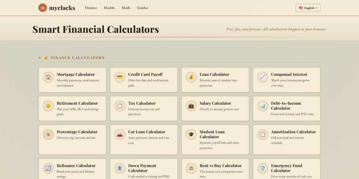
myclacks — screenshot

myclacks

AI-built · Ad-funded

Financial calculators — mortgage, loan, compound interest, retirement, tax, salary, debt-to-income — in fourteen languages across the US, Canada, UK and EU, wrapped in three dozen guides that do the actual ranking. Built, written, localised and optimised with AI.

Static siteClient-side mathsFourteen localesClaudeCode generation
4 notes
  • The calculators are the product; the guides are the distribution. Nobody searches for 'mortgage calculator' and reads — they search 'how much house can I afford on 100k' and want an answer. So each guide answers the question in prose and hands the reader the tool that does their own numbers.
  • Fourteen locales is not fourteen translations. Tax brackets, currency, date order and what counts as a normal mortgage term all differ, so the localisation had to reach the maths, not just the labels.
  • Money tools are trust tools. Everything is calculated locally, no account exists, and the formulas are named in the copy — a user who can see it is amortisation rather than a black box is a user who comes back.
  • What I would change: the tool list grew faster than the navigation did. Generation makes adding easy and pruning invisible, and a duplicated percentage calculator sitting in two sections is exactly the kind of drift that follows.
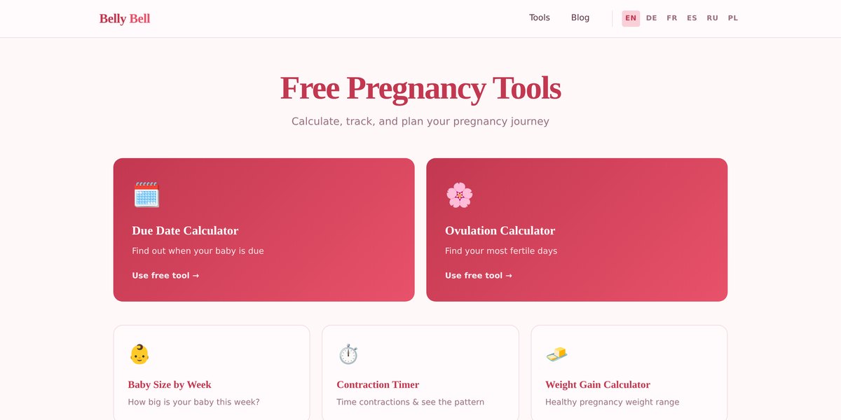
Belly Bell — screenshot

Belly Bell

AI-built · Ad-funded

Pregnancy and fertility calculators — due date, ovulation, fertile window, contraction timer, week-by-week tracking — in six languages, with an editorial layer around them. The narrowest of the three, and the one where the writing had to be handled most carefully.

Static siteClient-side mathsSix localesClaudeCode generation
4 notes
  • A niche audience with high intent beats a broad one. Someone working out a due date is at the start of a nine-month stretch of searches — which is why the tools sit next to a blog rather than alone.
  • This is health-adjacent content, so the tone had to be governed rather than generated freely. Naegele's rule is named, the estimate is framed as a window rather than a date, the Chinese gender predictor is labelled as entertainment with no scientific basis, and every page defers to a midwife or obstetrician. AI will happily write in a more confident voice than the subject deserves; the editorial rules exist to stop it.
  • Nothing is stored and no account exists — for cycle and pregnancy dates that is not a feature, it is the minimum. The calculations never leave the browser.
  • The three sites share one recipe: pick a question people already search, answer it with a tool that runs locally, write the surrounding page properly, translate it, and let it earn while you sleep. Belly Bell is the version where I had to argue with the generated draft the most.