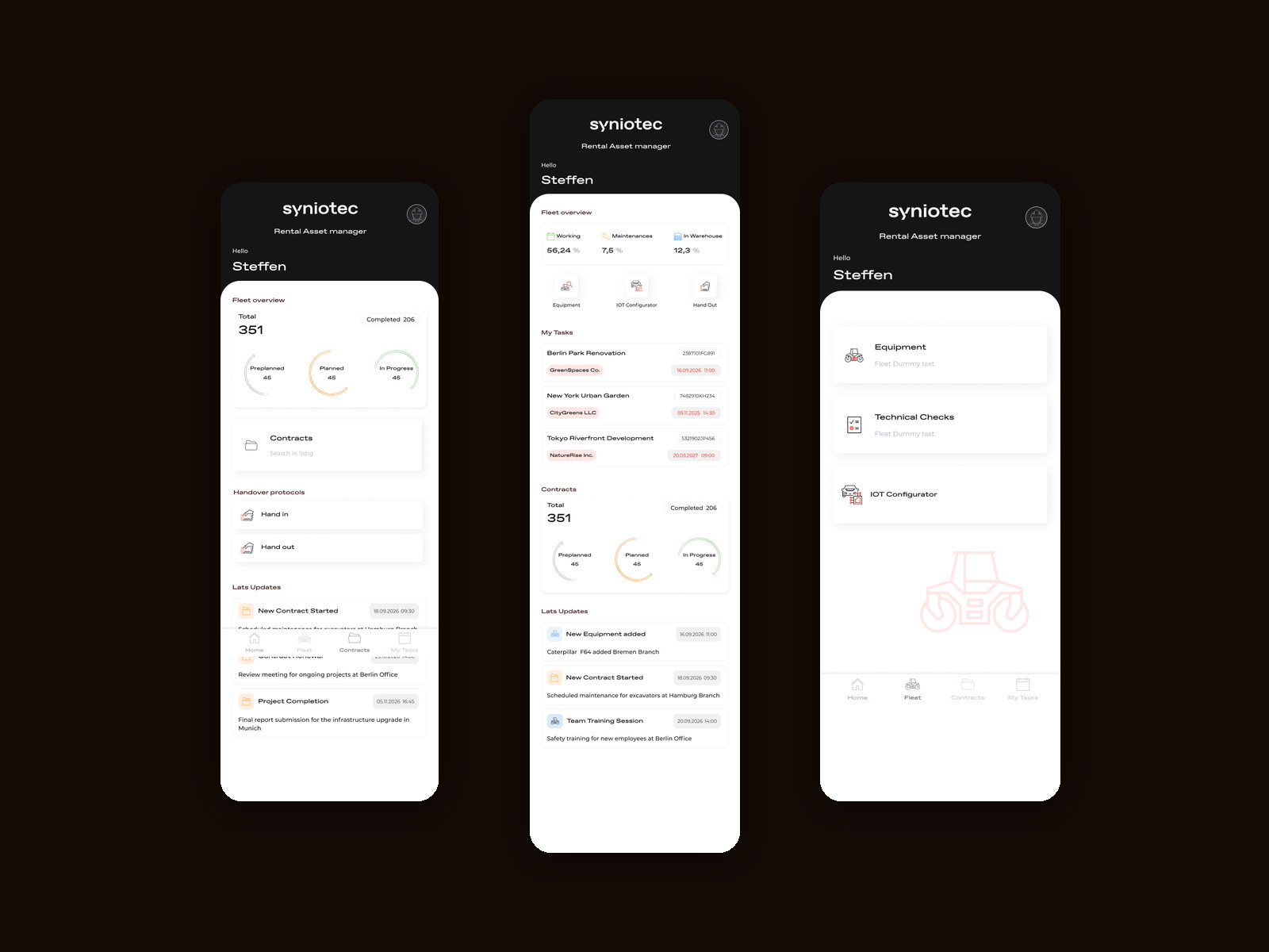
The desktop module holds everything. The person on site needs four things from it.
On the web, RAM turned a forty-field booking into a sequence that matches how a dispatcher thinks. That solved the problem for the person with a keyboard.
But a rental business is run across branches — Hamburg, Bremen, Berlin — by people who spend the day between a yard, a site and a van. They are not creating bookings from a phone; they are checking where the fleet stands, what is due today, and signing machines in and out at a gate.
Those four jobs were spread across a platform designed for a large screen, and in practice they were being done by phone call, WhatsApp and paper docket.
Read far more often than written
This is a client people open twenty times a day for ten seconds. Almost every session is a question, not an edit — so the design problem is answering fast, not capturing completely.
Porting the booking form would have been the obvious move and the wrong one.
The complex part of RAM is genuinely complex and belongs on a desk. What was homeless were the simple parts — fleet status, today's tasks, and the physical handover of a machine.
So the mobile client is not a smaller RAM. It is four objects — fleet, contracts, tasks, handover — each answerable in one screen, sharing the platform's data and its visual language.
Four objects in the tab bar, and a home screen that answers before you ask.
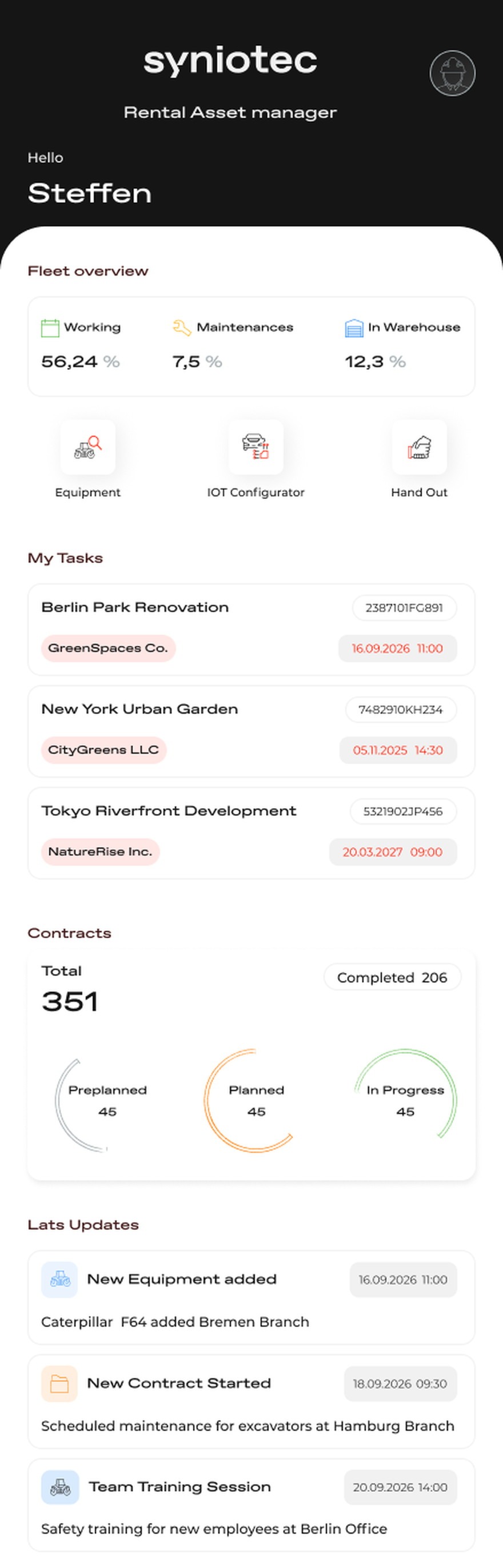
Home opens on the state of the fleet rather than a menu: utilisation across working, maintenance and warehouse, the contract pipeline as preplanned, planned and in progress against a completed total, the tasks assigned to you, and a feed of what changed since you last looked.
Everything below that is one level deep. Fleet holds equipment, technical checks and the telematics configurator; Contracts is a search; My Tasks is a list with a clock on it; and the handover protocols sit on the home screen itself, because signing a machine in or out is the thing most likely to happen while standing up.
Home answers, it does not navigate
Utilisation, pipeline, tasks and recent activity on one scroll.
A branch manager opening this app has one of about five questions, and every one of them is answered before a tap: how much of the fleet is earning, how much is in for maintenance, what is sitting in the warehouse, what is due today, and what has changed.
The pipeline is shown as three rings against a total rather than a table of contracts. Preplanned, planned and in progress are states you check, not records you read — a shape is faster than a number, and the number is there underneath it anyway.
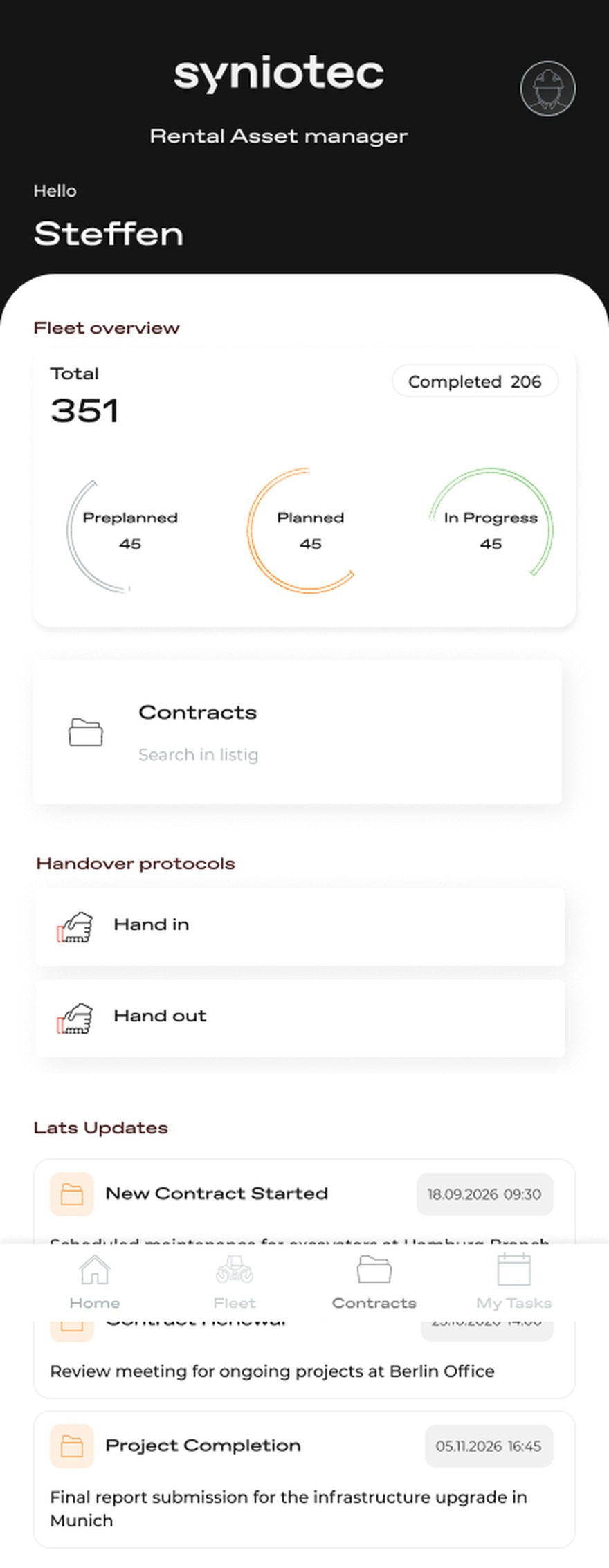
Handover promoted to the home screen
Hand in and hand out as two standing actions, not a buried flow.
Collection and return are where rental disputes are made or avoided, and they happen at a gate with a phone in one hand. Putting both protocols on the first screen means the record of an exchange is created at the moment of the exchange rather than reconstructed later.
Two directions, named plainly. The asymmetry matters — handing a machine out is a condition check and a signature; taking one back is the same check read against what was recorded on the way out.
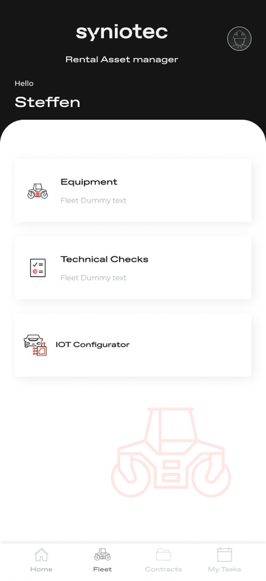
Fleet is three jobs, not a database
Equipment, technical checks and the IOT configurator.
The fleet tab could have been a searchable list of every asset. Instead it is the three things people do to a machine: look it up, inspect it, and configure what its telematics report.
Keeping the configurator next to equipment rather than in a settings area reflects how it is actually used — you configure a sensor while standing in front of the machine it is bolted to.
Tasks carry the client and the clock
Project, customer, contract number and a due time on every row.
A task without a deadline is a note. Each row carries the project, the company it belongs to and the moment it is due, with the time treated as the most prominent thing on the line — because the only real question is whether it is today.
The contract reference sits on the same row, so a task is one tap from the agreement it belongs to rather than a search away.
The branch fits on a phone.
Fleet utilisation, the contract pipeline, the day's tasks and the physical handover of machines are now answered in seconds from a device people already have on them, across branches, without opening the desktop platform.
The desktop module stays where complex bookings get built. Mobile owns the moments that were previously a phone call, a paper docket and a photo nobody could find.
What I would keep from this one
Extending a mature platform to mobile is mostly an exercise in refusing to port things. The temptation is to make the powerful screens responsive; the value was in noticing which parts of the workflow were never difficult, only badly placed.
The other thing I would keep is the ratio: this is a read-mostly product with two write actions on the front page, and being honest about that is what kept it to four tabs.