Opening a deposit online is a small flow with an unusually high cost of doubt.
The customer is choosing between products that differ in ways banks find obvious and customers do not — term, rate, whether you can top it up, what happens if you withdraw early. Three options with similar names and different consequences.
It also has a legal spine. Terms have to be presented, mandatory fields have to be filled, and the confirmation has to be unambiguous, because what is being agreed is a contract rather than a purchase.
And the fallback is always available: if the screen is confusing for thirty seconds, the customer calls the branch, and the digital channel has failed at the only moment it was supposed to save anybody time.
Make the comparison, not just the form
The hard part is not entering the amount. It is knowing which of the three deposits is the right one — and that decision was happening on the phone, not on the screen.
Nobody abandons a form because it is long. They abandon it because they are no longer sure they are doing the right thing.
Every drop-off in this flow traced back to a moment of uncertainty rather than a moment of effort — which product, what the terms mean, whether this is reversible.
So the work went into the deciding rather than the filling in: the three products presented so they can be compared, the terms readable where the decision is made, and a confirmation that restates what is about to happen.
Compare, agree, confirm — in that order, with no step doing two jobs.
The three deposit types are presented side by side on their differences rather than their names, so the choice is made once and the rest of the flow inherits it. Terms and conditions are readable at the point of selection instead of behind a checkbox at the end.
The rest is a short form of genuinely mandatory fields, a review screen that restates the deposit in plain language, and a notification when it is open. Afterwards the deposit appears in the account dashboard with its balance and interest earned, because a product you cannot see is a product you will phone about.
Compare on the difference, not the name
Three deposits shown side by side on term, rate and access.
Product names carry meaning inside a bank and none outside it. Laying the three out against the attributes that actually differ turns a naming problem into a reading problem.
Doing this before the form means the customer commits once. Every later screen can then be about completion rather than reconsideration.
Terms where the decision is
Readable at selection, not hidden behind a final checkbox.
Presenting terms at the end guarantees they are agreed rather than read, and it puts the least comfortable moment immediately before the commitment.
Moving them next to the product turns them into part of the comparison — which is what they are.
A confirmation that says it back
Amount, term, rate and date restated before submission.
The last screen before a financial commitment should contain no new information and no new decisions. Restating the deposit in plain language is what lets somebody press the button without hesitating.
A notification on completion closes the loop, and the deposit appearing in the dashboard afterwards is what keeps the customer from calling to check it worked.
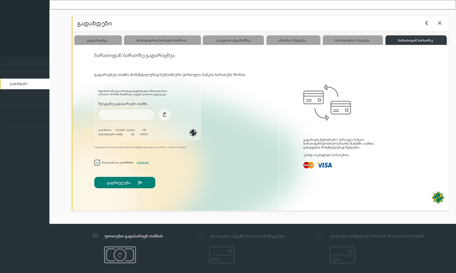
A deposit opened on a screen instead of at a counter.
The flow works on phone, tablet and desktop, and the deposit is visible and manageable afterwards — balance, interest, terms — without contacting the bank.
The change that carried the most weight was moving the product comparison before the form, which is a structural decision rather than a visual one.
What I would keep from this one
Banking flows are usually optimised for fewer fields. This one needed fewer doubts, which is a different problem and often means adding content rather than removing it.
The measure I would use again: not how long the flow takes, but at which step somebody would reach for the phone.