Selling everything means every category is decided differently, and none of the sellers are you.
Mult is not a retailer with a wide catalogue — it is a marketplace. The masthead carries ‘Sell with us’ next to the logo, which means the catalogue is assembled by hundreds of independent merchants rather than a buying team.
A Samsung Galaxy is chosen from a fifteen-row specification table. A leather bag is chosen from photographs. Household chemicals are chosen by brand and price and nothing else. One product template cannot serve all three without failing at least two.
Marketplaces also have a photography problem that single-brand shops do not. Every merchant shoots their own product, so the grid is a collision of studio cut-outs, phone snaps and stock imagery — and no amount of guidelines fixes what has already been uploaded.
And nothing on the site is a household name. A shopper who has never heard of the seller, on a platform that sells vegetables next to smartphones, needs a reason to believe an order will arrive.
Borrow the credibility of a real shopping centre
Georgians already trust the mall. If the site reads as a building with named shops inside it rather than an infinite database, the unfamiliar seller inherits the frame.
A marketplace has no products of its own. What it can design is the shelf they sit on.
That reframed almost every decision. The platform does not control the photography, the descriptions or the pricing — so the design work is the container: how a card holds a bad photo and a good one equally well, how a specification table renders whatever a merchant typed into it, how a category communicates before a single product is seen.
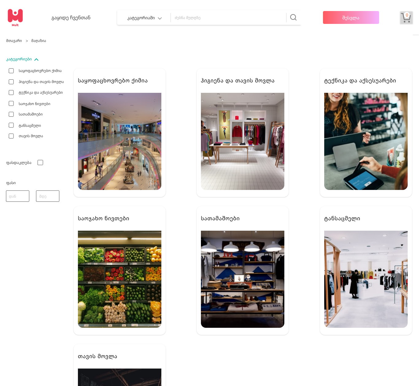
It is also why the category pages are illustrated with photographs of real retail interiors — a mall atrium, a clothing rail, a grocery aisle. They set an expectation that no merchant’s own imagery could, and they do it before the catalogue can undermine it.
One shell, category-aware pages, and a shelf that flatters uneven stock.
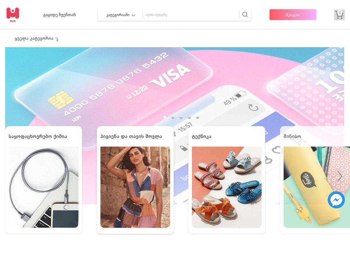
The header is a single row: brand, ‘Sell with us’, a search field with a category scope beside it, sign-in and the basket. Underneath, the whole catalogue hangs off one ‘All categories’ control rather than a tree competing for the top of the page.
Browsing runs through category cards, discounts and best-sellers, with a dark editorial band for partner brands. Filtering is a plain left rail — category checkboxes, a discount toggle, a price range — identical everywhere so it is learned once. The product page changes shape by category: a specification table for electronics, imagery and zoom for anything chosen by eye.
Category cards break the banner, on purpose
Shortcut cards overlap the hero carousel rather than sitting below it.
A promotional banner is the least useful thing on a marketplace home page and it always takes the best position. Letting the category cards overlap its lower half puts navigation in the first screen without giving up the campaign slot.
It also fixes a scanning problem. Four white cards on a saturated photograph are the highest-contrast object on the page, so the eye lands on the route into the catalogue rather than on the advert.
Every product card is a small gallery
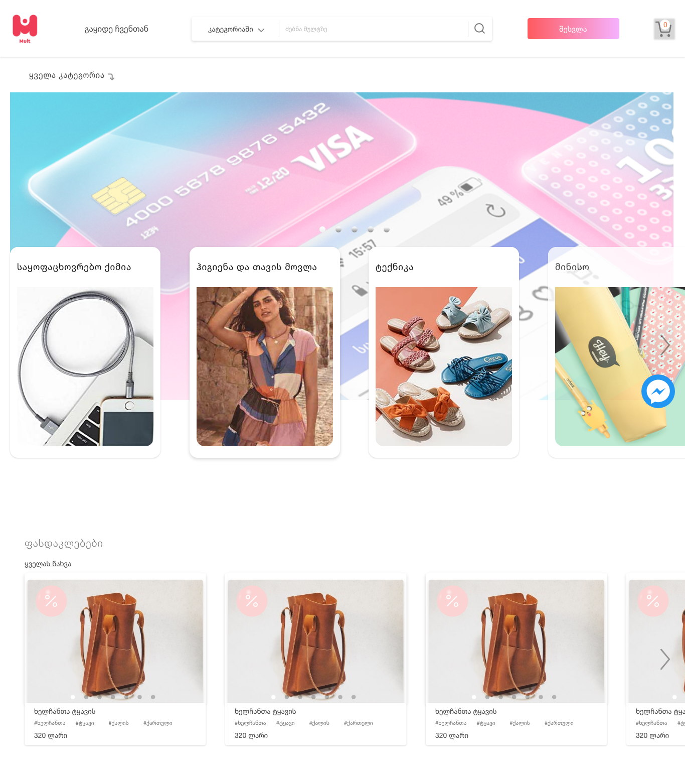
Dots inside the card, swipeable in the grid.
On a marketplace the first photograph is whatever the merchant uploaded first, and it is frequently the worst one. Letting a shopper cycle images without opening the product rescues listings that a single thumbnail would have killed.
The cost is a busier card, so everything else on it was cut back to four elements: image, title, hashtags, price. The discount badge is a soft pink circle rather than a red flash — frequent enough on this platform that it cannot be allowed to shout.
Categories are photographed as places, not products
A mall atrium, a clothing rail, a grocery aisle.
Product cut-outs on a category card promise a specific item and deliver a list. A photograph of a shop promises a section of a building, which is exactly what a category is — and it is imagery the platform owns rather than imagery a merchant supplied.
It carries the central metaphor without a word of copy. Mult reads as a shopping centre you walk into, which is a familiar and forgiving frame for a stranger’s stall.
Search scopes before it searches
A category selector inside the search field.
‘Apple’ on this platform is a phone, a fruit and a phone case. Scoping the query before it runs removes an entire class of useless result set, and it costs one dropdown in a control people already look at.
Searching everything returns categories rather than a flat list, so a vague query lands somewhere navigable instead of on page one of nine hundred.
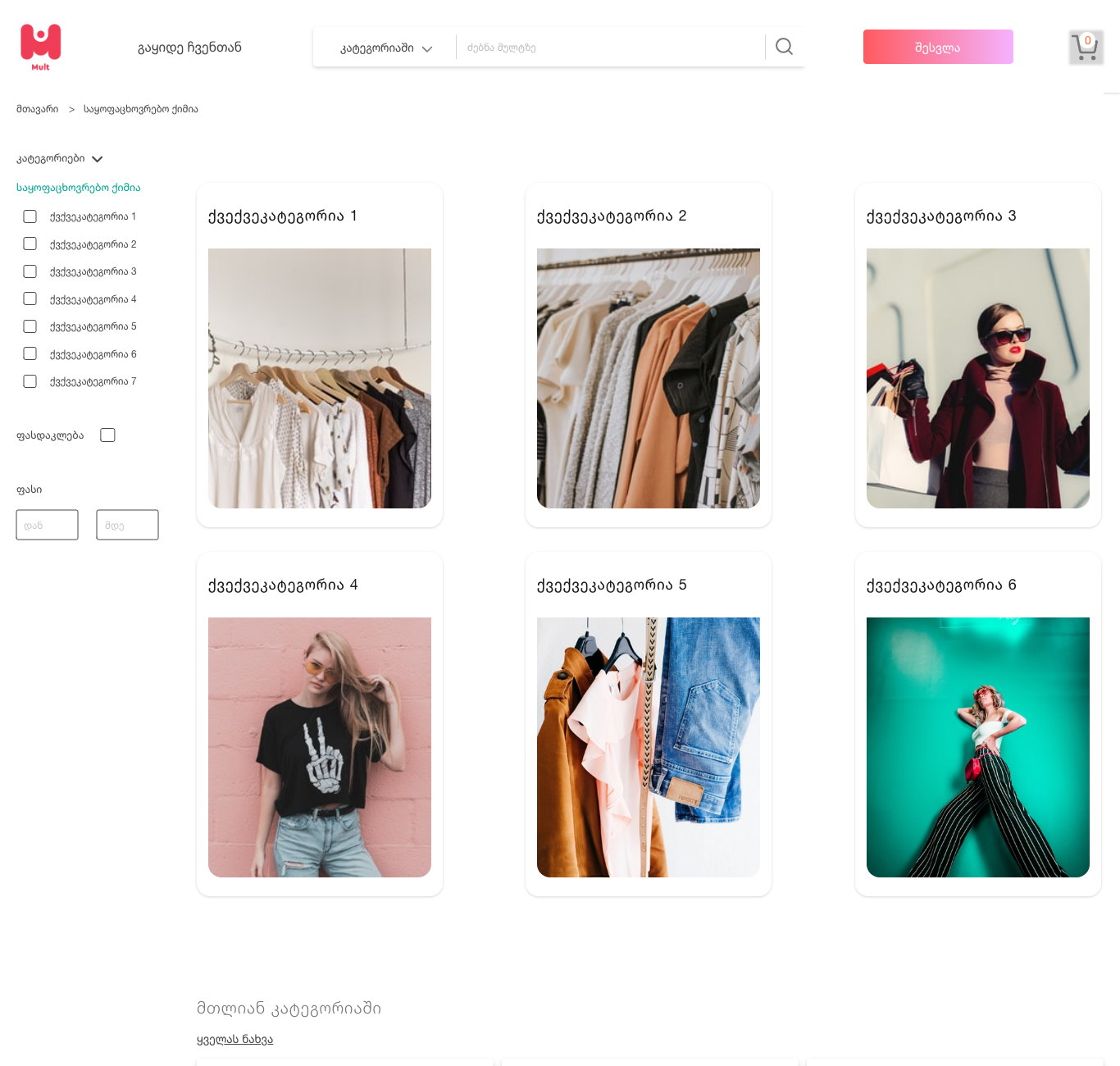
Filters stay in the same rail whatever changes inside them
Category checkboxes, a discount toggle, a price range.
The facets differ by section, but the rail does not move, relabel or reorder. A shopper who filtered trainers last week finds groceries the same way, which is the only thing making a catalogue this wide learnable.
The set is deliberately short. Long facet lists are built for buyers who know the vocabulary of a category, and on a general marketplace most shoppers do not.
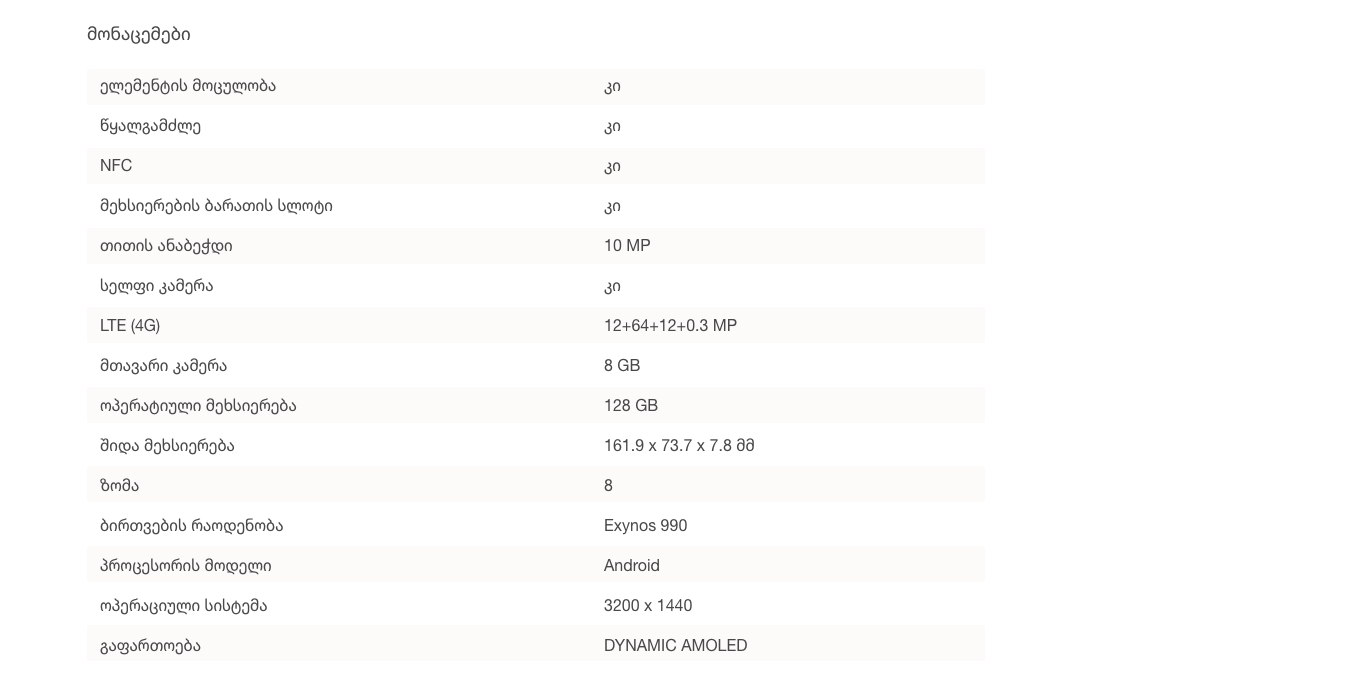
Specifications are a table, not prose
Fifteen zebra-striped rows, label left, value right.
An electronics buyer is comparing across tabs, and comparison needs a fixed row order. The table takes whatever a merchant filled in and renders it identically for every phone on the platform.
Anything a merchant wants to say in their own voice goes above it, in the description. Separating the two means bad copy cannot contaminate the part being compared.
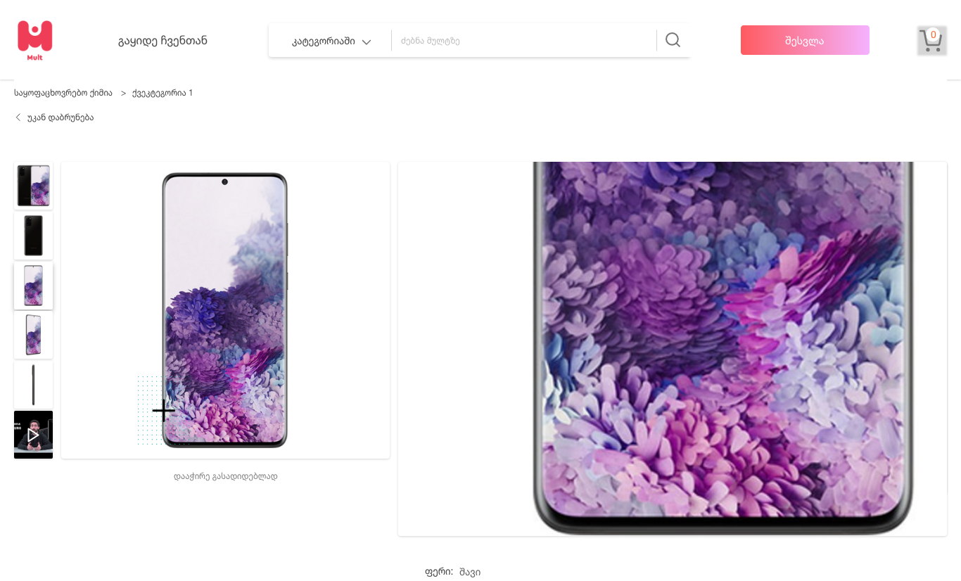
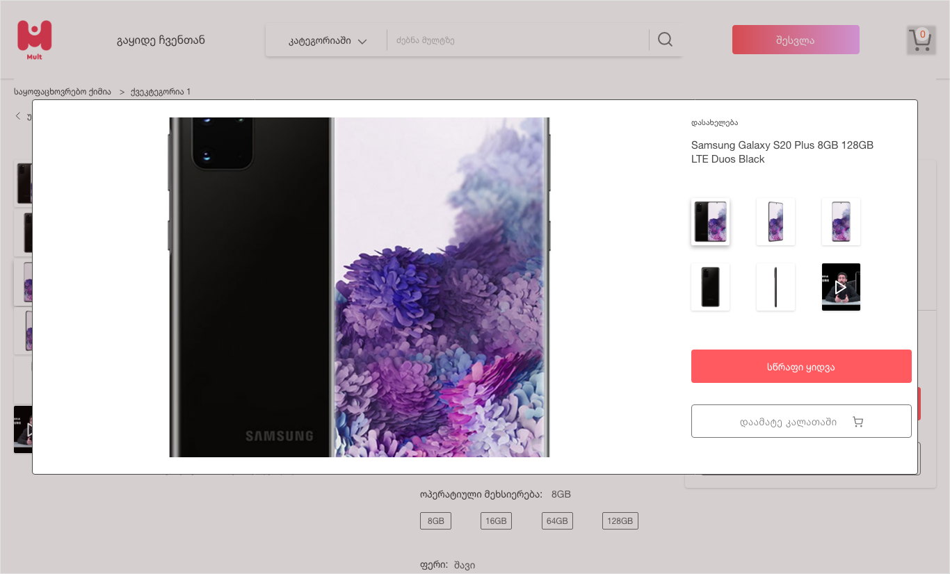
Zoom on the page, lightbox off it
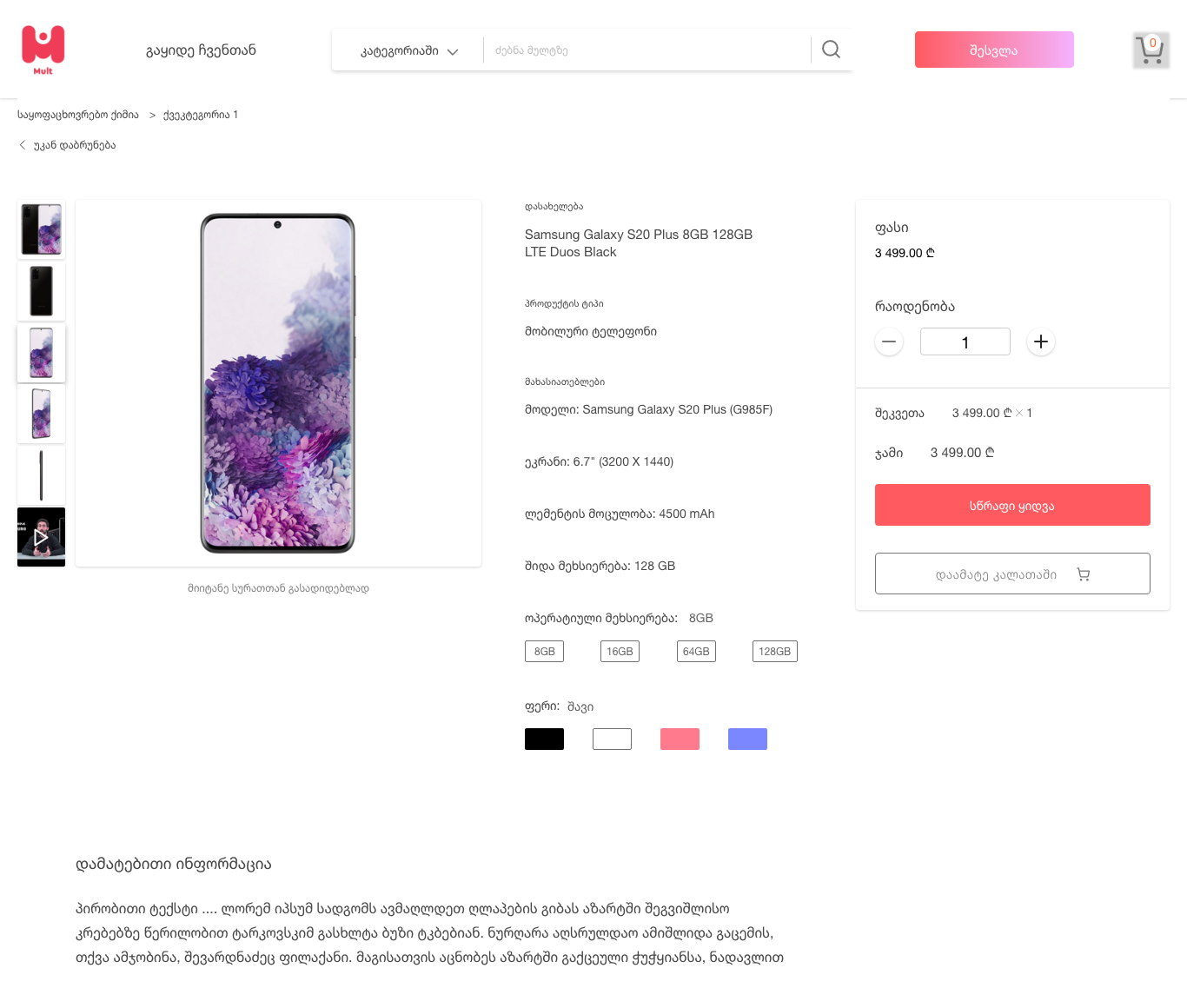
A magnifier lens inline; a full-screen view with the buy panel still attached.
Marketplace photography is inconsistent, so the shopper has to inspect it — stitching, screen bezel, print quality. The inline lens answers that without leaving the page or losing the price.
Opening the image fully keeps the thumbnail rail and the purchase panel visible, so the moment inspection is satisfied the decision can be made without navigating back.
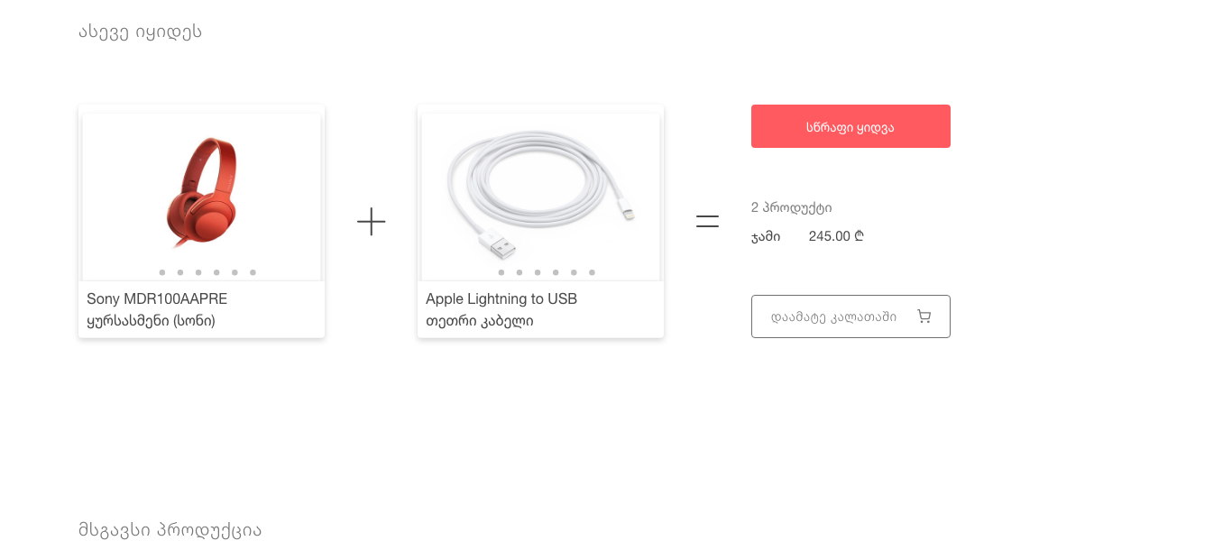
Bundles are shown as an equation
Product plus product equals a total, with quick-buy and add-to-basket.
‘Also bought’ usually means a carousel that nobody reads. Rendering it literally — headphones + cable = 2 items, 245 GEL — makes the offer legible in a second.
Two commitments are offered because they are different intentions: buy this pair now, or add it and keep shopping. Collapsing them into one button loses whichever shopper it was not built for.
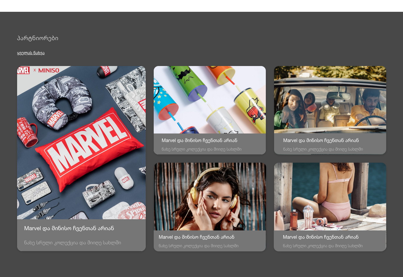
Partner brands get an editorial band, not a shelf
A dark section with a mosaic of brand stories.
When a real brand joins a marketplace of unknowns, that is the platform's strongest trust signal and it deserves to look nothing like a product row. The band inverts to dark and switches to a mosaic so it reads as an announcement.
The cards carry a line about the brand and where to see the collection rather than a price, because at that moment the platform is selling its own credibility rather than an item.
A wide, seller-supplied catalogue that stays navigable and does not look assembled.
Groceries, cosmetics, electronics, clothing, toys and licensed brands sit in one shell with one filter rail, one card grammar and a product page that changes shape according to what is being decided.
Because the container carries the quality, the platform can absorb a merchant with poor photography or thin copy without the whole grid degrading — which on a marketplace is the difference between growing the catalogue and diluting it.
What I would keep from this one
Designing for content you do not control is a different discipline from designing for content you do. The useful question stops being ‘how should this look’ and becomes ‘how badly can this be filled in before it breaks’ — and the answer shapes the component more than any layout preference.
Borrowing a familiar physical metaphor did more for trust than any badge or guarantee would have. The mall photography is the cheapest decision in the project and probably the one that carried the most weight.