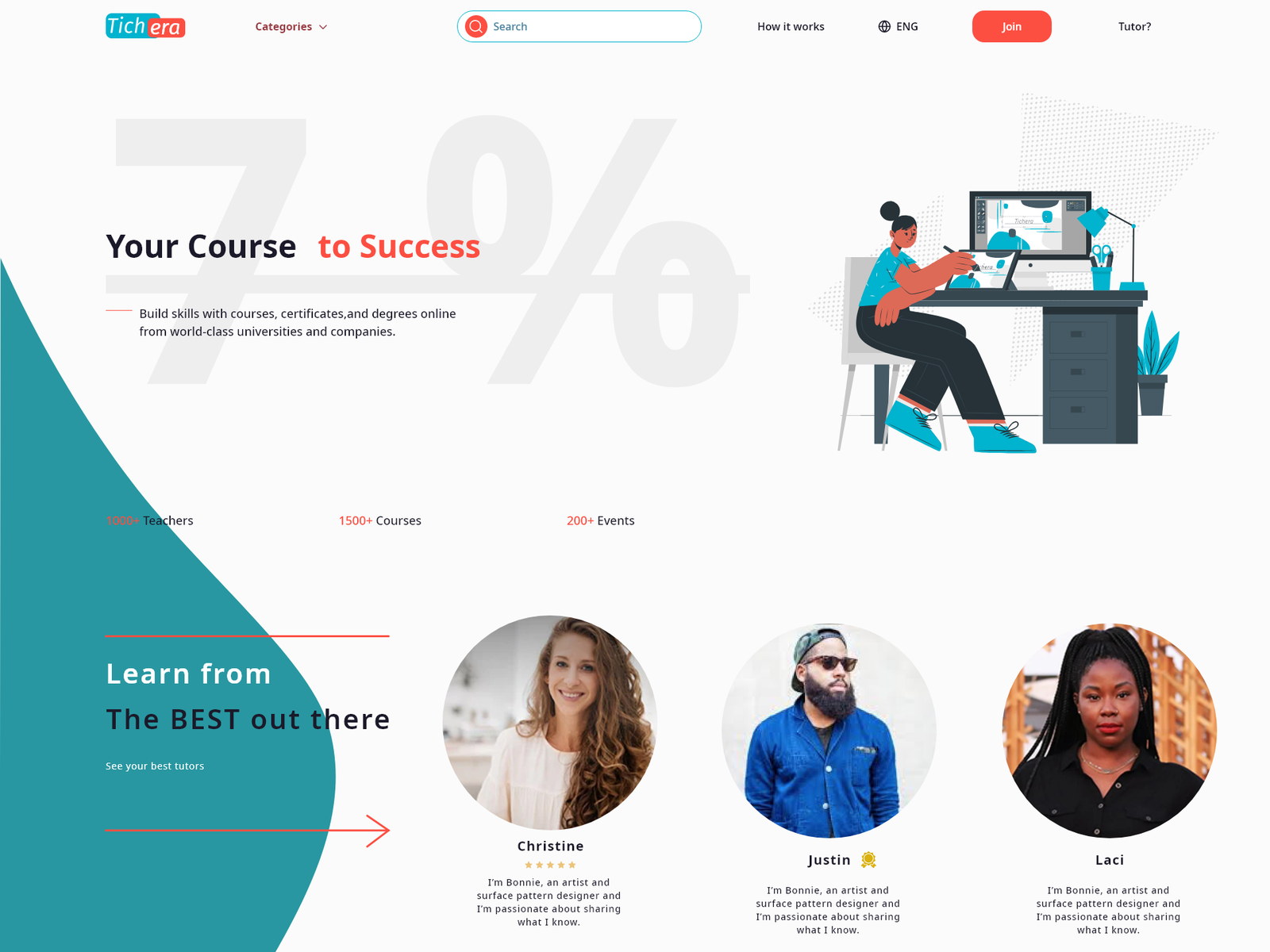
A tutoring marketplace is three products pretending to be one, and it only pays for itself if somebody books twice.
There is a directory, where a student finds somebody who teaches chemistry at a price they can afford. There is a scheduling system, which has to reconcile two calendars across time zones. And there is a payments system, which has to hold money, release it, and handle the argument when a lesson does not happen.
Only the first of those is a design problem. The other two are years of engineering, a payments licence in every market, and a support team — for a product with no users yet.
And the marketplace is only half the product. The moment somebody pays, they land in a signed-in workspace that has to carry the rest of the relationship: when is my class, how do I join it, what did the tutor send me, this session did not happen. Most marketplaces design that half last, if at all — which is exactly the half that decides whether there is a second booking.
Own the choosing and the teaching, borrow the rest
The two things only this platform can do are helping a student pick the right person, and holding the relationship afterwards. Scheduling, payment and video can be somebody else's problem for as long as the interface is honest about it.
Tutors did not need us to build a calendar. They needed us to be the reason someone opened it.
Every tutor already had a Calendly link, a PayPal.me link and a Google account, and all three worked perfectly well. Rebuilding any of them would have taken months and produced something worse.
So the platform is deliberately thin where it can be and thick where it cannot. The booking hands off to the tutor's own calendar and payment link; the classroom embeds Meet. What is built from scratch is the part nobody else was doing — the directory, the reputation layer, and a workspace that opens on what is happening next.
One product in two halves: a directory that earns a booking, and a workspace that survives it.
Signed out, Tichera is a marketplace. You browse tutors by category, compare on four facts, read reviews and reserve a session on a profile that carries everything a decision needs.
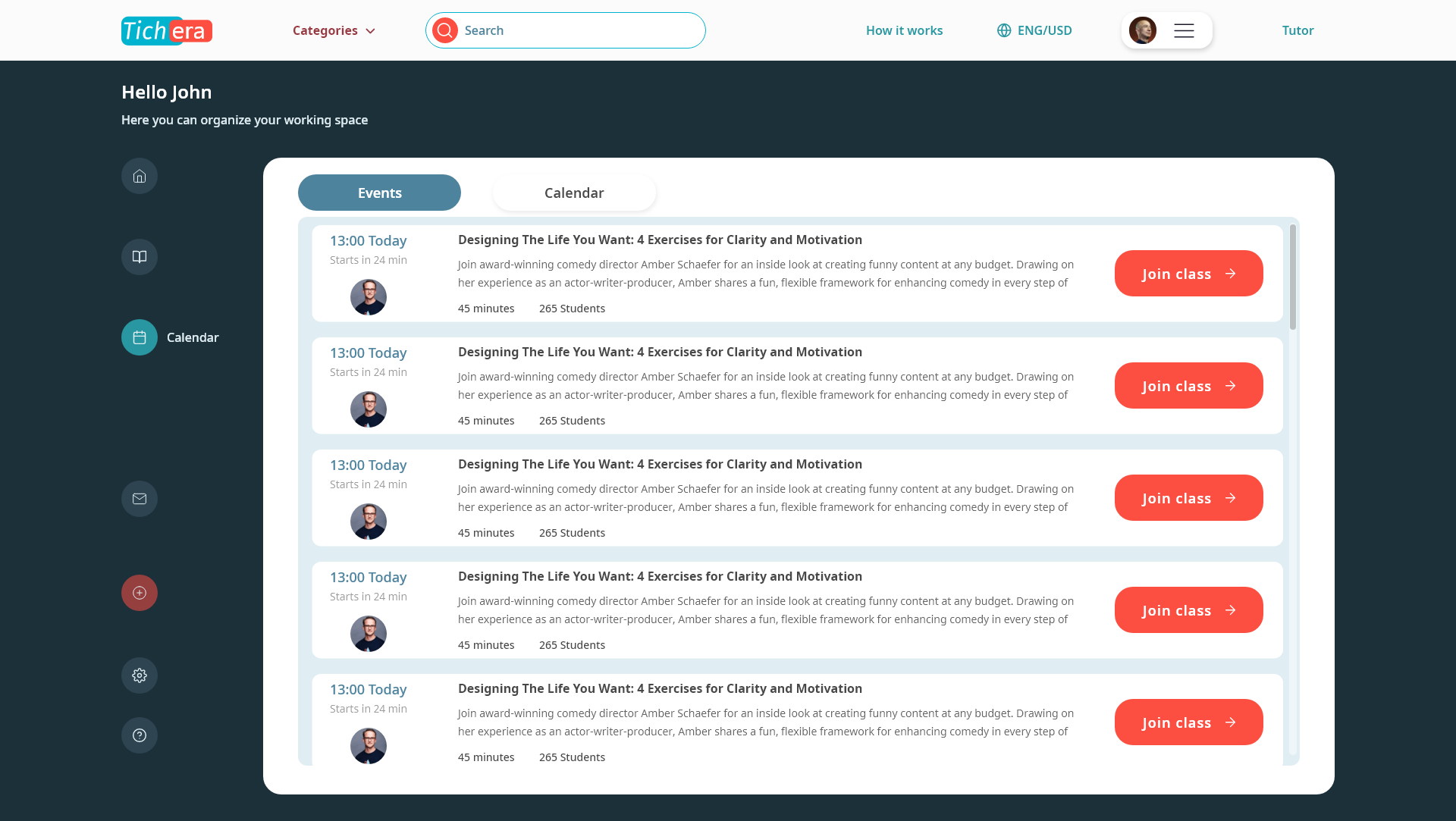
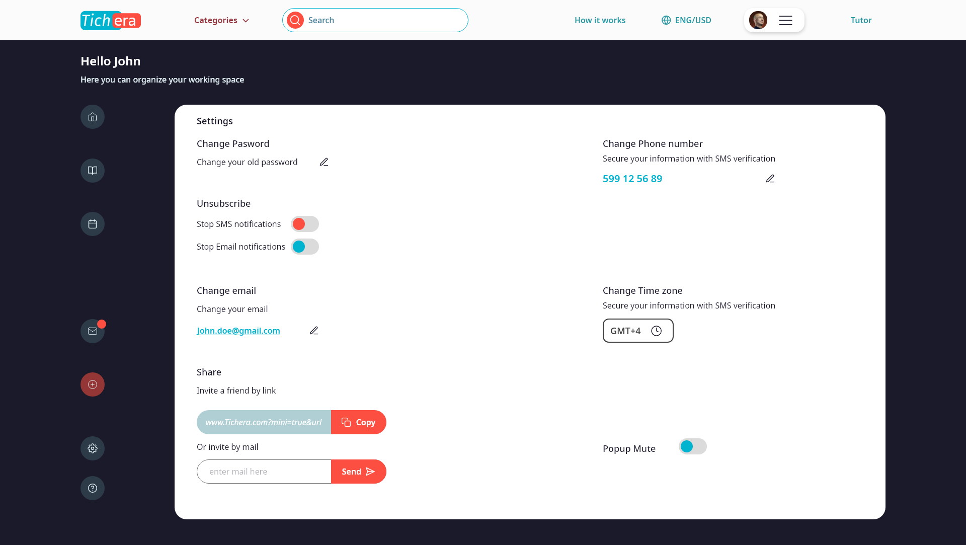
Signed in, it becomes a workspace down a slim icon rail — home, calendar, classroom, notifications, settings. The same shell serves both sides of the market: the tutor creates courses and events, the student joins them, and neither has to learn a different product. Choosing Learn or Teach at sign-up changes what you see, not who you are.
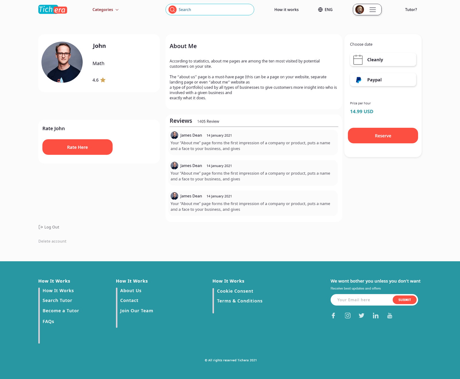
The profile is where the money decision happens
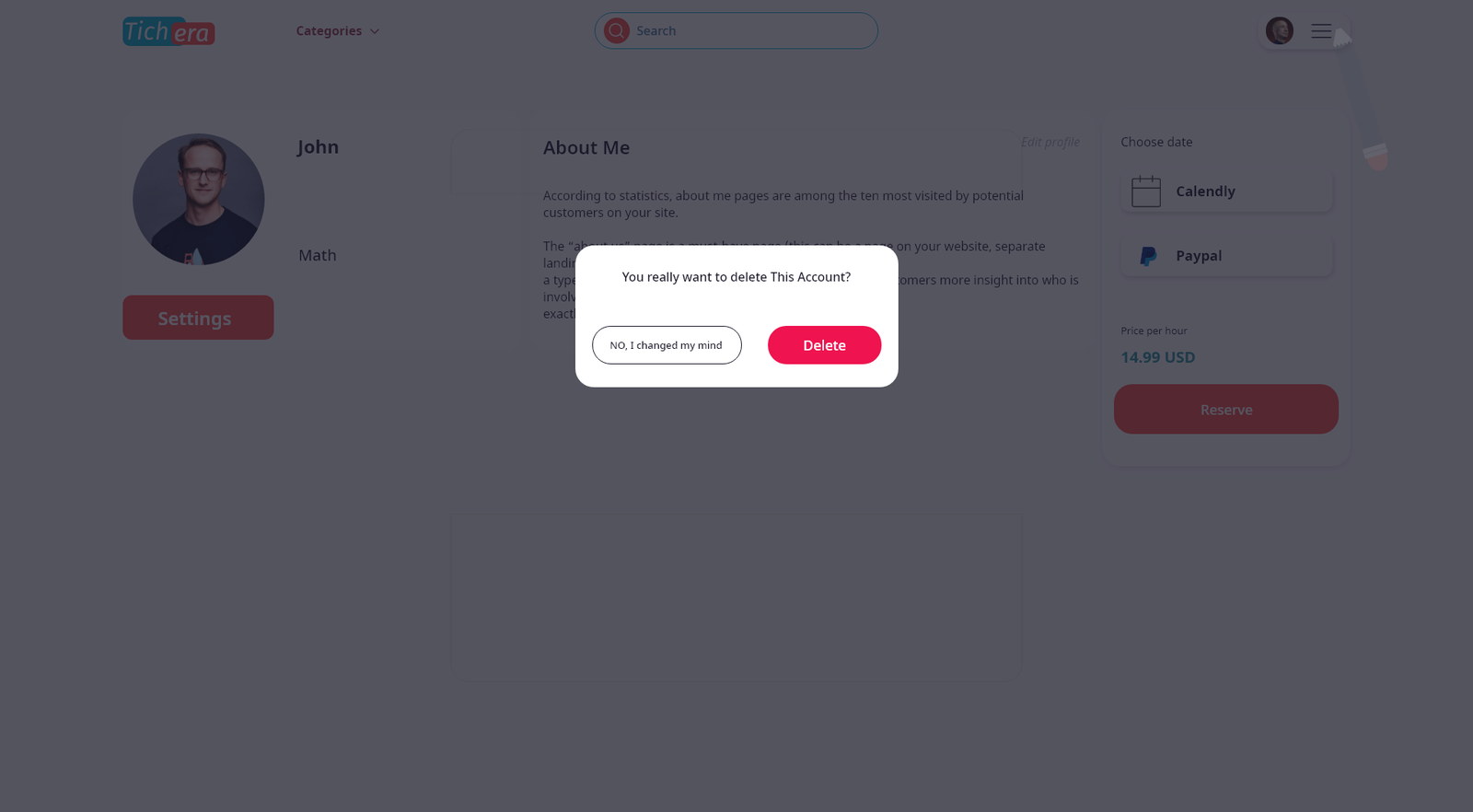
Photo, subject, rating, hourly price, About Me and reviews — on one screen.
Every other surface in the marketplace exists to deliver somebody here. So the profile has to answer the whole question in one scroll: who is this person, are they any good, what do they cost, and can I book them now.
Price sits in the right-hand rail directly above Reserve, with the Calendly and PayPal steps visible beneath it before the button is ever pressed. Nobody discovers how the booking works after committing to it.
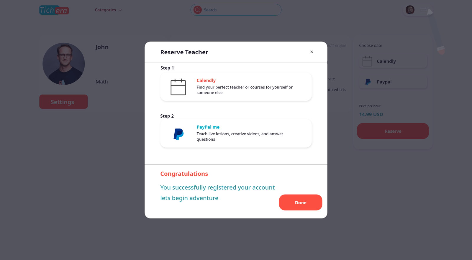
Reserve is two steps, and neither belongs to us
Step 1 the tutor's Calendly. Step 2 the tutor's PayPal.
The modal is honest about what it is: a numbered handoff to two external tools, in the order they have to happen. Disguising that as a native checkout would have implied a guarantee the platform could not make.
It also made tutor onboarding almost free. A tutor pastes two links they already own into their settings, sets an hourly price, and is bookable — no bank details, no verification queue, no waiting for the platform to approve them.
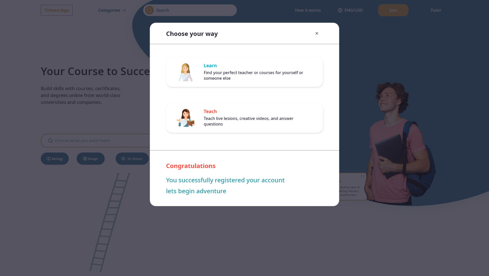
One account, two directions
Learn or Teach at sign-up, and a switch you can change later.
Splitting a marketplace into two account types is the standard move and it is usually wrong — it forces a decision at the least informed moment and traps people who are both. The same person can tutor chemistry on Tuesday and take a Spanish lesson on Thursday.
The How it works page follows the same rule. One page, a Teacher / Student toggle, and the same steps told from each side, so the two halves of the market can read each other's version and know what to expect.
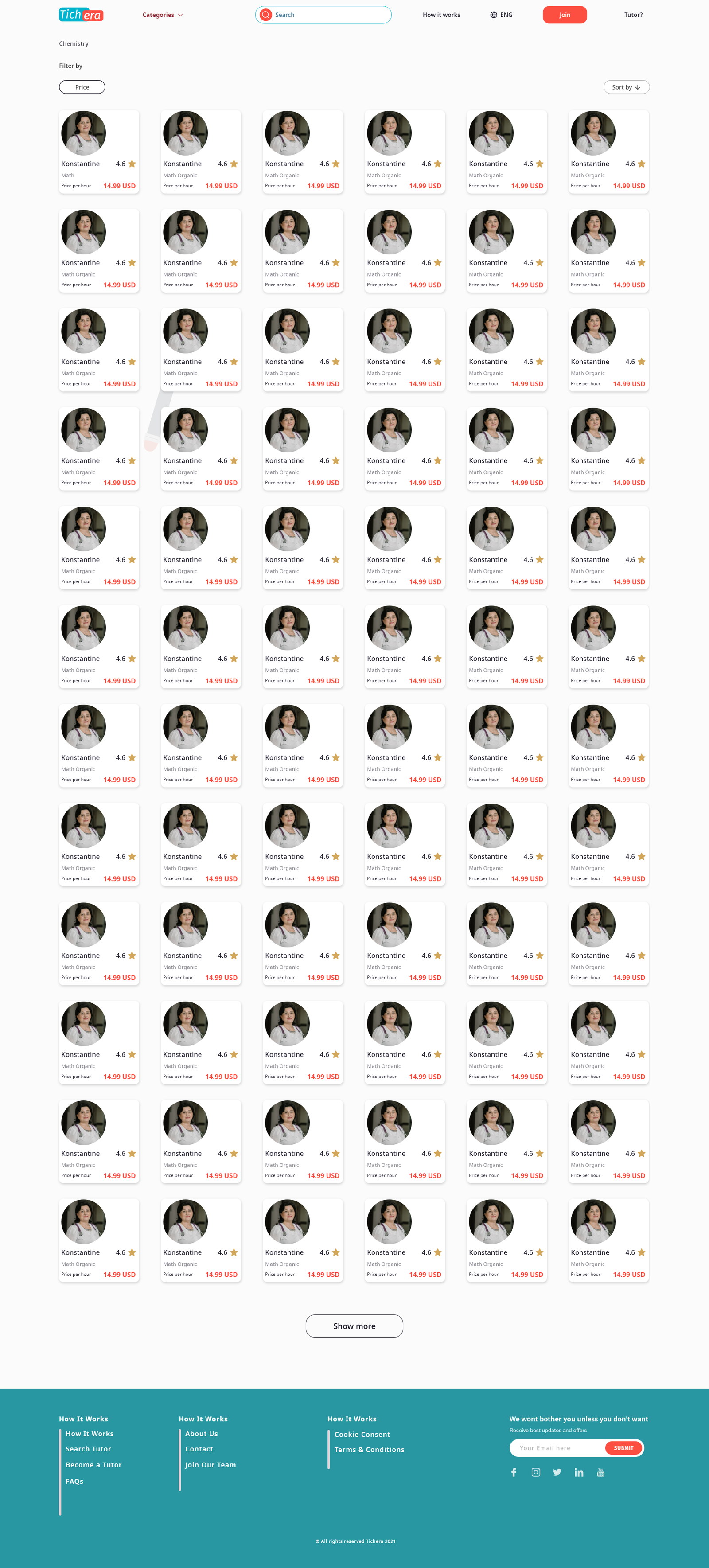
The tutor card is four facts
Photo, name, subject, rating, hourly price — then filter and sort.
In a grid of a hundred tutors the card has one job: support a comparison. Anything richer slows the scan, and anything less makes the price the only variable, which is a race the good tutors lose.
Filtering by price and sorting explicitly are the two controls a student actually reaches for. The category tree does the rest of the narrowing before the grid is ever seen.
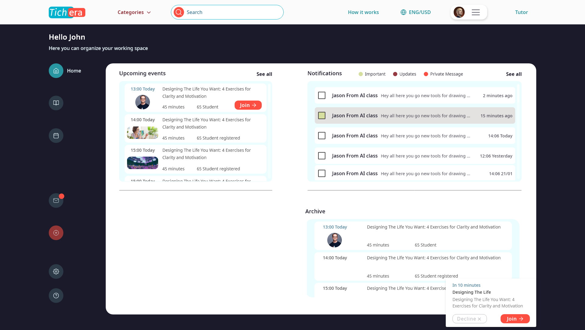
The dashboard opens on time, not on identity
Upcoming events beside notifications, archive below.
Nobody opens this to manage an account. They open it because a class starts in ten minutes — so the home screen answers what is happening now, what is happening next and what did I miss, in that order.
A class about to start announces itself as a toast with Join and Decline on it rather than waiting to be found. The most time-critical action in the product should not require navigating to it, because a missed lesson is a refund and a bad review.
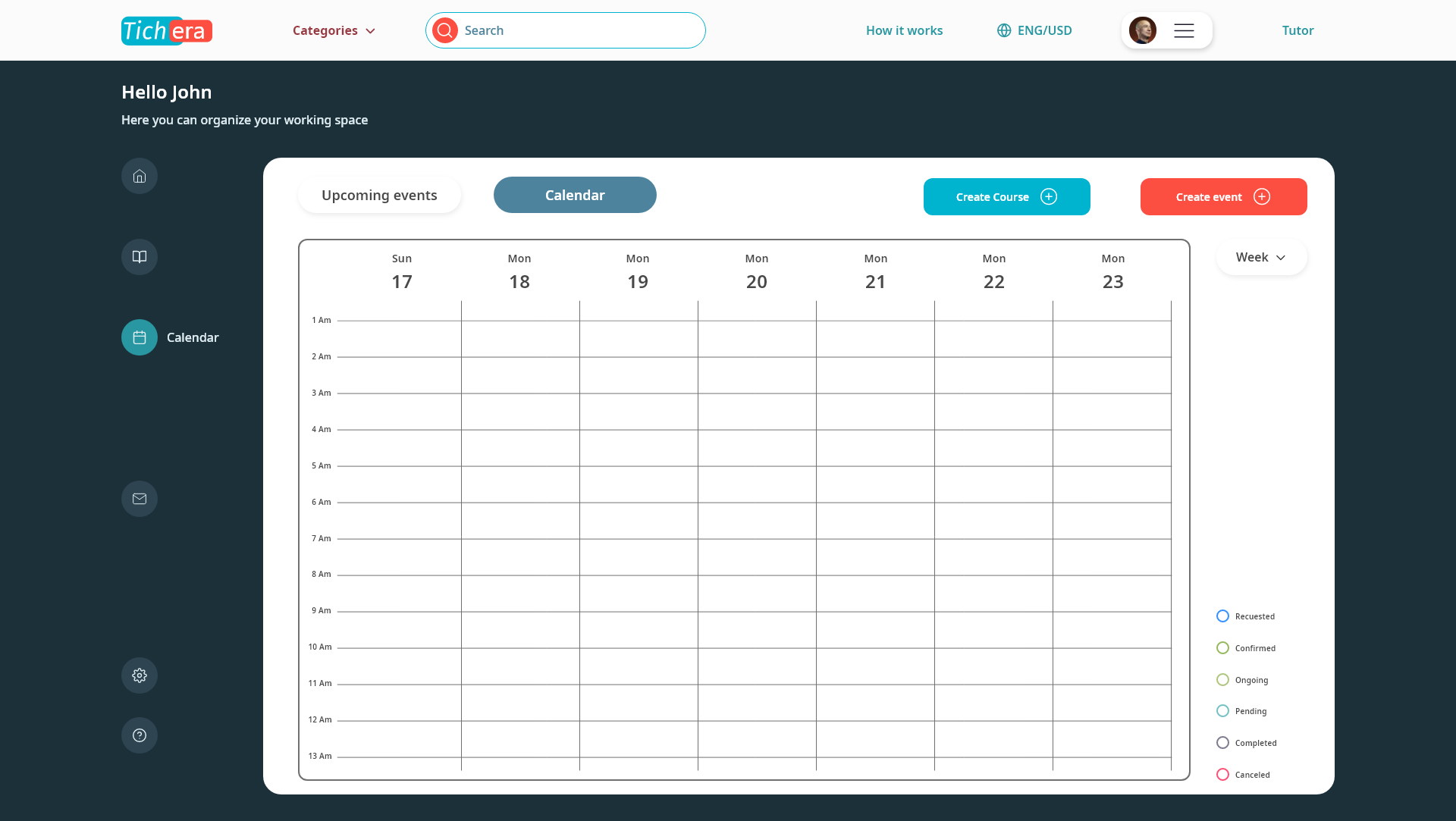
The week carries six states, colour-coded once
Requested, confirmed, ongoing, pending, completed, cancelled.
A tutoring calendar is not full or empty — it is six degrees of committed, and the difference between requested and confirmed is the difference between hoping and being paid.
The legend sits beside the grid permanently rather than in a tooltip, because a colour system with six values is not one anybody memorises in a week. Create course and Create event sit here too, where the thing being made will appear.
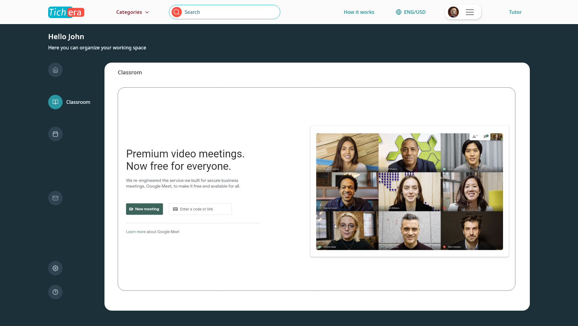
Use Google Meet and say so
The classroom embeds Meet rather than building a video product.
Building video for a tutoring marketplace is months of work to arrive somewhere worse than free. Embedding it kept a small team on the part that was actually theirs.
It is presented plainly rather than skinned to look proprietary — a tutor who already knows Meet has nothing to learn, which is the entire benefit of borrowing it.
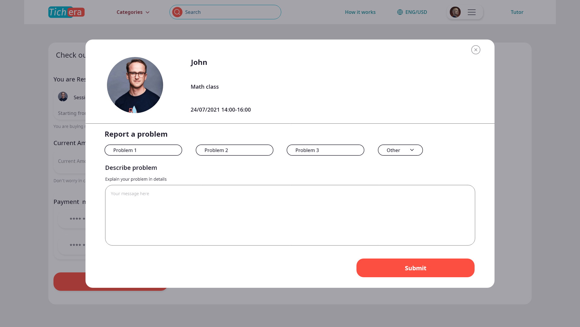
Reporting a problem starts with the lesson
The tutor, the subject and the exact session, above the form.
Without escrow the platform cannot arbitrate a payment, but it can make complaining easy and specific. A form that begins with a blank text box makes the user reconstruct which class they mean.
Opening with the session already identified — name, subject, date and time — turns the report into one sentence of actual content, and three named categories mean most arrive already routed.
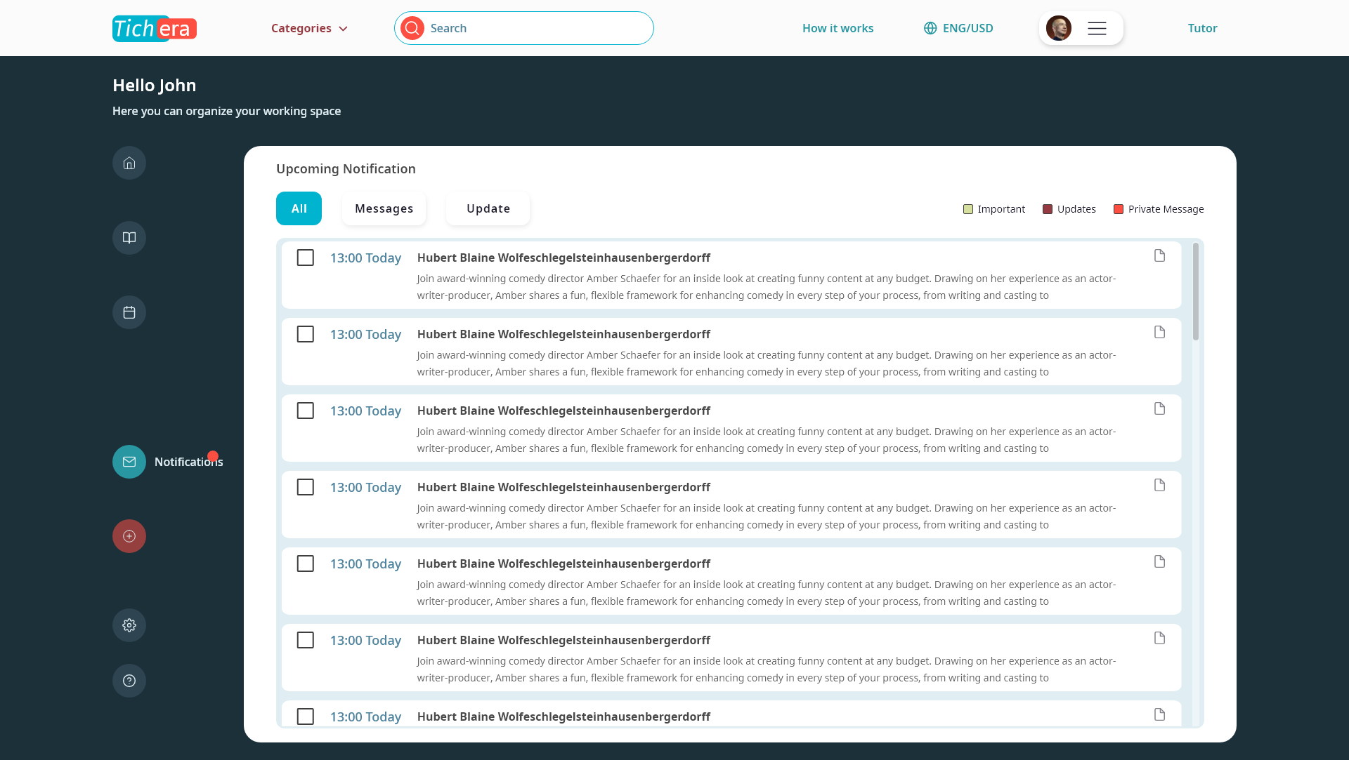
Notifications sorted by what they ask of you
Messages, updates and important, as filters over one list.
A message from a tutor needs a reply; a platform update needs nothing. Merged into one stream, the ones that matter get lost among the ones that do not.
Read state is a checkbox rather than a subtle change of weight, because this list is triaged rather than read.
A marketplace that shipped without a payments licence, and a workspace that gave it a second booking.
Tutors publish a profile, paste two links and set a price; students search, compare, read reviews and book. Afterwards both sides share one workspace — a six-state calendar, the classroom, notifications, settings and a route to report a session that failed.
The platform never touches money and never holds a calendar, which is what let it exist at all. The design language — teal, coral, flat editorial illustration, generous white space — was built to make a directory of strangers feel like a school rather than a listings site.
What I would keep, and what the trade-off cost
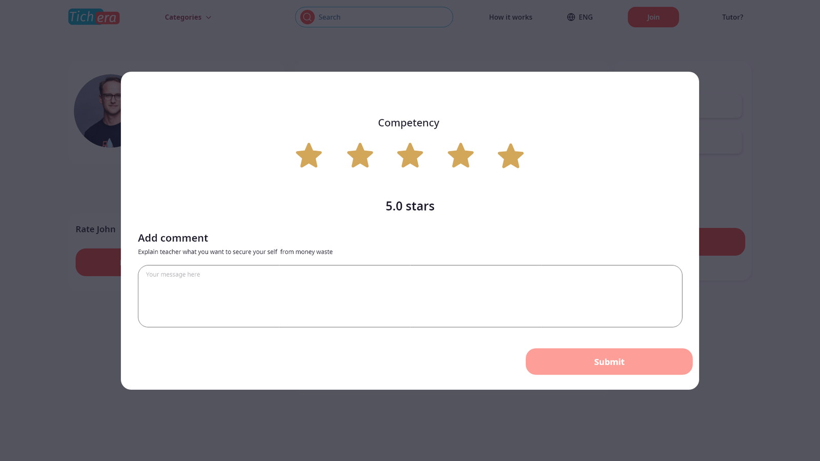
Borrowing scheduling, payment and video was the right call for launch and it has a real price: with no escrow, the platform cannot arbitrate a lesson that did not happen. Reviews are the only protection a student has, which puts far more weight on the rating system than it was designed to carry. If I revisited it, that is where the next version of the work would go.
On a small team, deciding what not to build is most of the design work — and the honest version is admitting in the interface which parts are somebody else's. The other lesson is duller. Placeholder copy survived into flows people actually see, and on a marketplace, where the entire product is asking a stranger to trust another stranger, unfinished text is not a cosmetic bug.