The product calls itself a virtual psychologist. Most of the design work was deciding what that is not allowed to mean.
An app that asks about anxiety, self-worth and how you handle failure is asking clinical questions. It is not a clinician, and the distance between those two things has to be visible in the interface rather than buried in a terms page.
The audience made it harder rather than easier. Georgian has very little of this material — few apps, few translated instruments, and a culture where talking to a psychologist still carries some weight. For many users this would be the first structured thing they had ever read about their own thinking.
And the content is long. Cognitive behavioural material is explanatory by nature: several paragraphs before a single question is worth asking. On a phone, that is the hardest kind of content to hold someone through.
First contact, not clinical care
The realistic best outcome is that someone learns a little, recognises something in themselves, and — where it matters — goes and talks to a professional. The interface had to be designed for that outcome rather than for retention.
Teach first, then ask. A question you do not understand does not measure anything.
Screening instruments assume the person answering knows what is being asked and why. Drop those questions on someone cold and you get noise — politeness, guessing, and the answer they think is correct.
So every questionnaire in the app is preceded by the explanation it depends on: what the pattern is, why it matters, what the exercise will do about it. The teaching is not context around the test; it is the reason the test means anything.
A guided sequence — read, answer, practise — with the limits of the product stated in the copy.
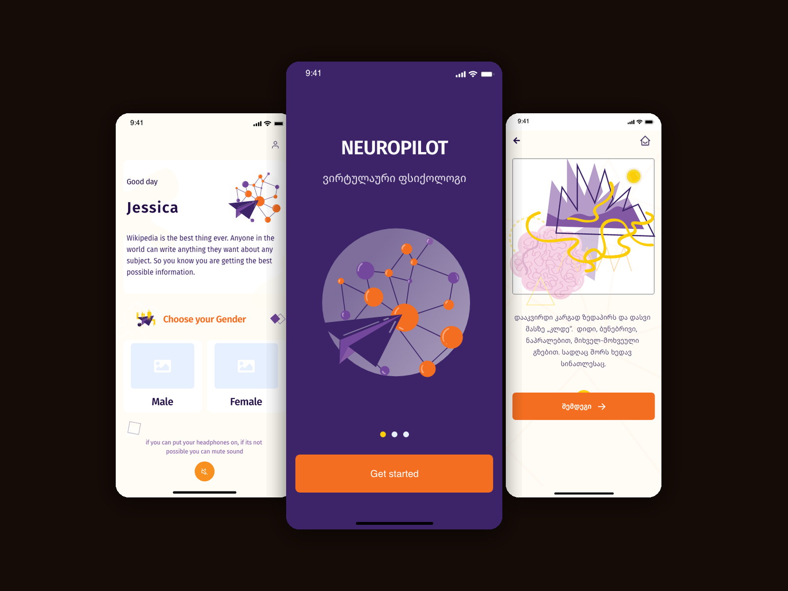
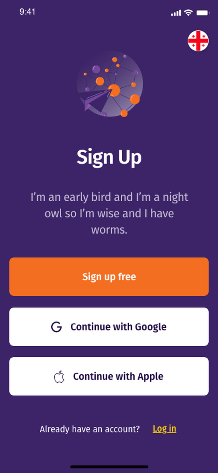
The app opens as what it is: NEUROPILOT, a virtual psychologist, in Georgian, with three onboarding cards and one action. Sign-up offers a free account, Google or Apple, with the language switch in the corner because the whole product is written for one market.
From there each module follows the same shape: an illustrated explanation, one questionnaire, and a practice session with audio. The visual language — warm cream, deep purple, flat editorial illustration — was chosen to sit as far as possible from anything clinical.
The name is a promise, so it is stated plainly
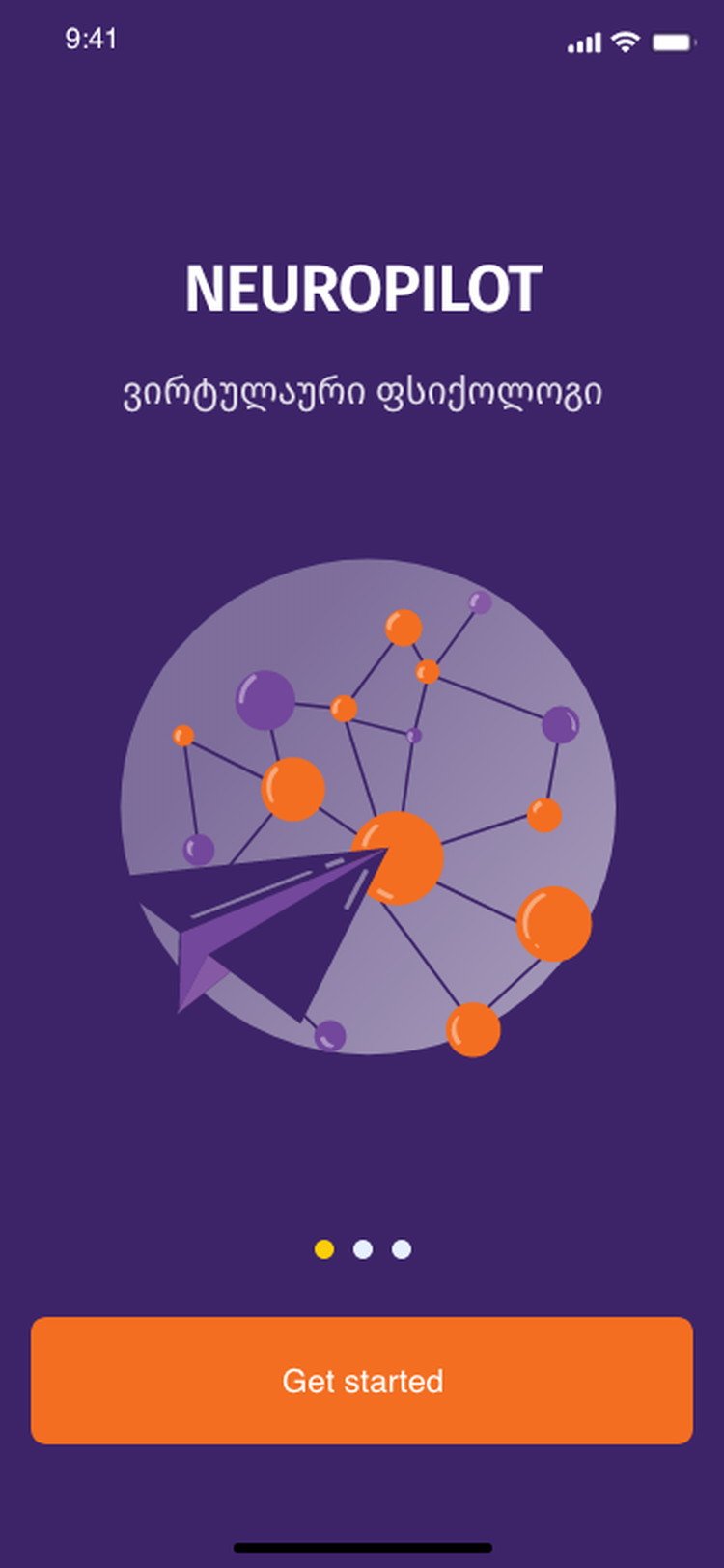
NEUROPILOT — ვირტუალური ფსიქოლოგი, and nothing more implied.
Calling a product a virtual psychologist sets an expectation in one word. The onboarding does not embellish it — three cards, a subtitle, an illustration and a single button, so the promise stays the size it can actually deliver.
The illustration system does the reassuring instead of the copy. A paper plane and a node graph are friendly and abstract; a brain scan or a couch would have made a claim the product cannot support.
A greeting that sets the conditions
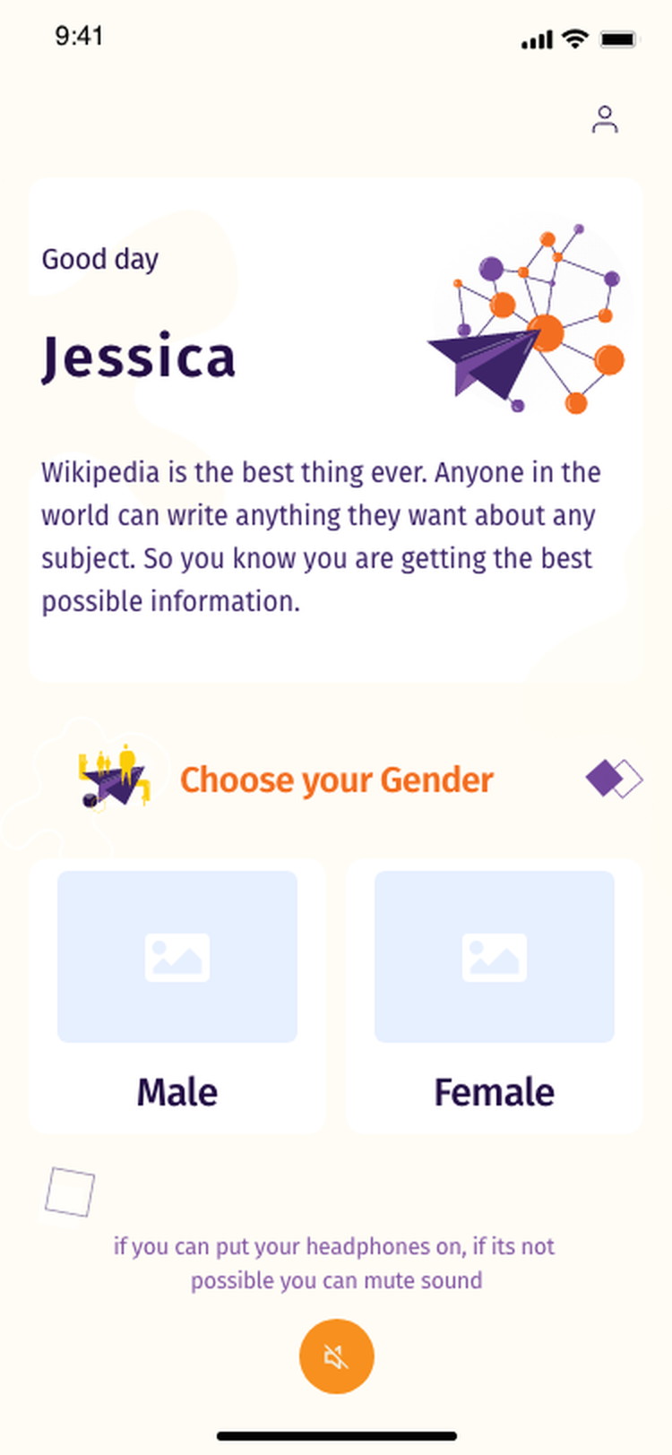
Name, a short orientation, and the headphone prompt before anything begins.
The session opens by addressing the person by name and telling them how to sit with it — headphones on if possible, muted if not. Audio-guided exercises fail quietly when someone starts them on a train with the sound off, so the requirement is stated before the first module rather than discovered halfway through.
The mute control then stays available on every screen that carries audio. Consistency here is a trust matter: a wellbeing app that surprises you with sound has broken something more important than a preference.
Two kinds of question, and the interface says which
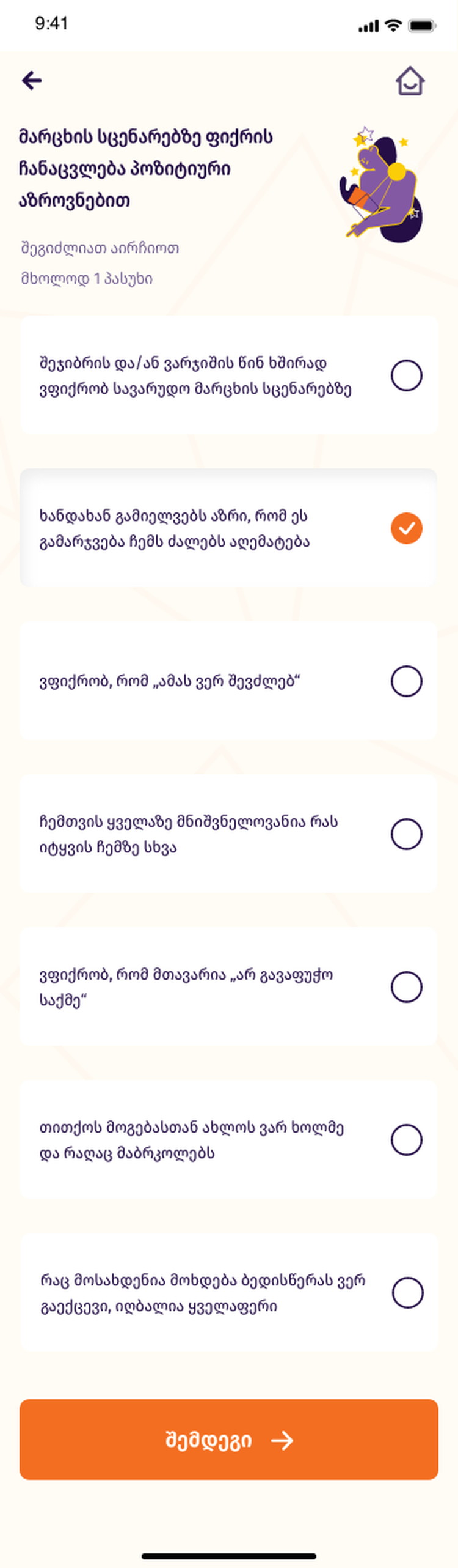
“Select one or more” and “only one answer”, written above the options.
Multi-select and single-select look nearly identical on a phone and mean completely different things to the instrument underneath. Stating the rule in words above the list — rather than trusting a circle to imply it — removes the most common way a self-assessment gets answered wrongly.
Options are full-width rows with the target spanning the whole card, because the answers themselves are long sentences about uncomfortable feelings and should not be reached for through a small circle at the edge of the screen.
The explanation carries the weight, not the result
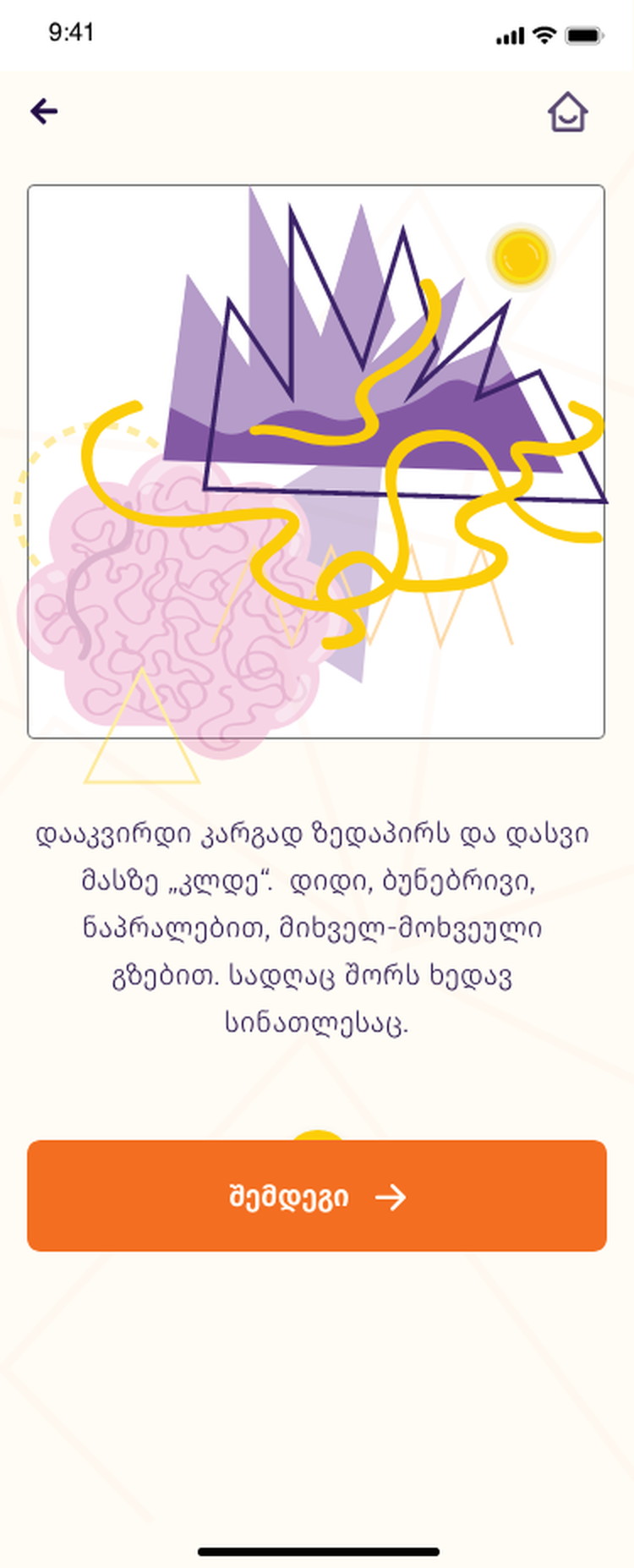
Several paragraphs before the exercise, and a footnote about the time it takes.
Each module explains the pattern it addresses — replacing failure scenarios with a different way of thinking — in plain language before asking anyone to practise it. This is the longest text in the product and the part that earns everything after it.
A quiet footnote states how long the programme takes and when results become available. Setting the pace explicitly is what stops the app being judged as a thing that did not work overnight.
A result that says what it is not
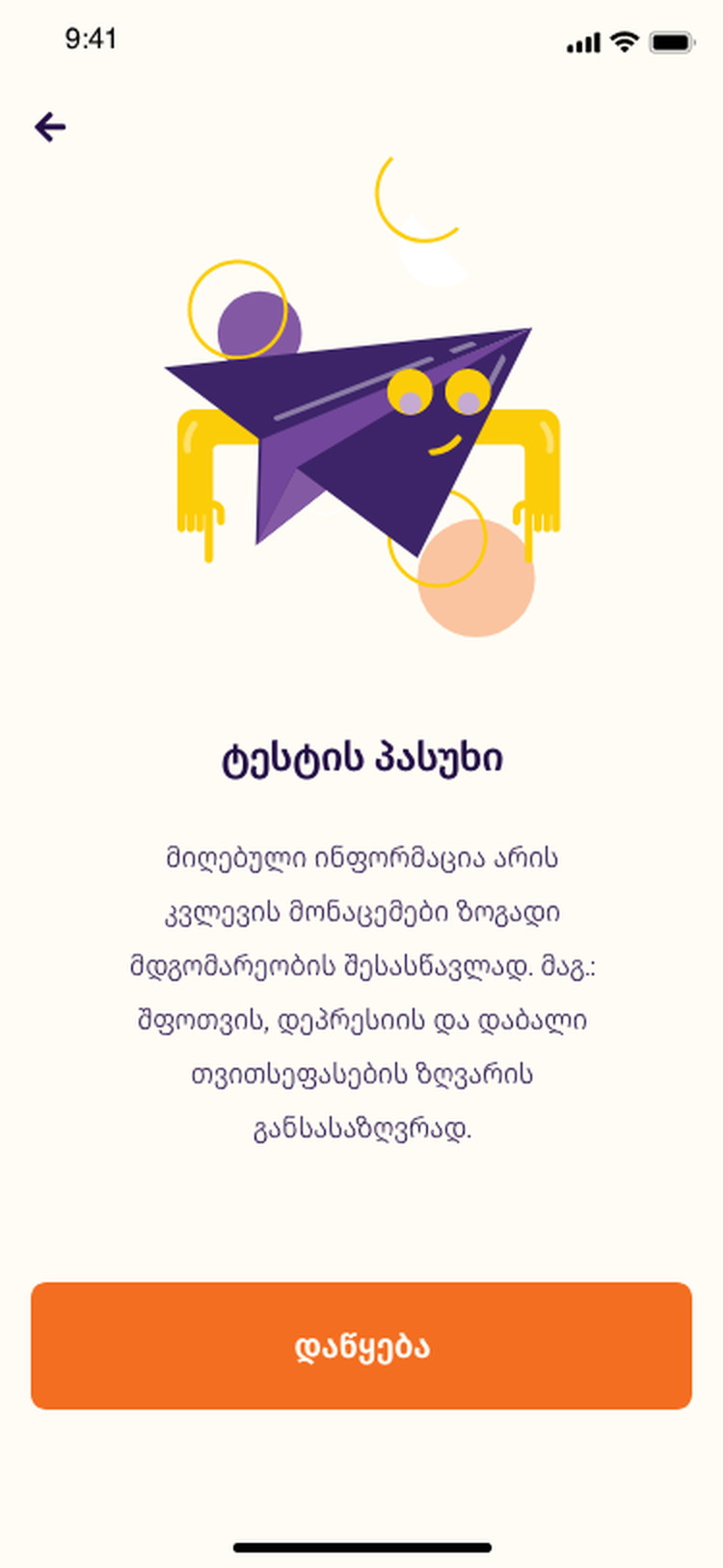
ტესტის პასუხი — framed as a general indication, not a diagnosis.
The answer screen states that the information gathered is for general assessment — of anxiety, low mood and self-perception — rather than a finding about the person. That sentence is the most important copy in the product and it is on the screen, not in a policy.
It also sets up the only honest escalation an app like this has: noticing something is useful, and acting on it usually means talking to somebody qualified.
Structured psychological material, in Georgian, on a phone.
The app delivers cognitive behavioural content as a sequence a person can actually finish — explanation, self-assessment, guided practice — in a language where almost none of this existed in app form.
The patterns that carried the most weight were the least visual ones: stating the question type, stating the audio requirement, stating the time it takes, and stating what a result is not.
What I would keep, and what I would revisit
Two visual directions were explored — a light one built around a 3D brain, and the warm cream-and-purple editorial direction that shipped. The second won because the first looked medical, and looking medical is a claim.
What I would revisit is the placeholder copy that survived into the onboarding cards. Lorem-ipsum jokes in a product about anxiety are a small thing that says the wrong thing, and the first screen is where a nervous user decides whether to trust the rest.