Every other thing a bank makes lives on a screen. This one lives in a wallet for three years.
A card has to do several jobs at once with almost no room: identify the bank in half a second, tell the holder which product they have, satisfy Visa and Mastercard’s placement rules, survive a card printer, and still look like it belongs to the same family as the six cards beside it.
It is also the most durable brand asset a bank owns. A campaign runs for a month; a card is handed over at a till hundreds of times over its life, usually face-up, usually next to somebody else’s.
And the constraints are unusually hard. Chip and contactless positions are fixed, network marks have minimum sizes and clear space, the magnetic stripe and signature panel own the back, and the printed data has to stay legible at a glance in bad light.
The tier is the design problem
Nothing else on the card can vary much. So the entire product ladder has to be carried by colour and by one word.
On a counter, the card is read at arm’s length by someone who is not looking for information.
That rules out most of what a designer would want to add. Pattern, texture and illustration all compete with the two things that have to survive that glance: whose bank it is and which card it is.
So the family was built the other way around — strip the face to almost nothing, and let a single flat colour do the work of naming the tier.
One layout, six colours, and a back that earns its keep.
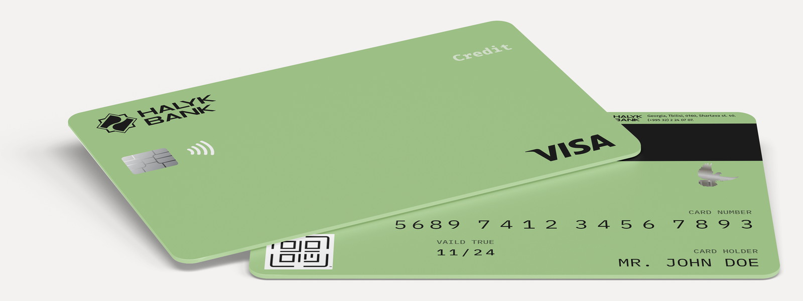
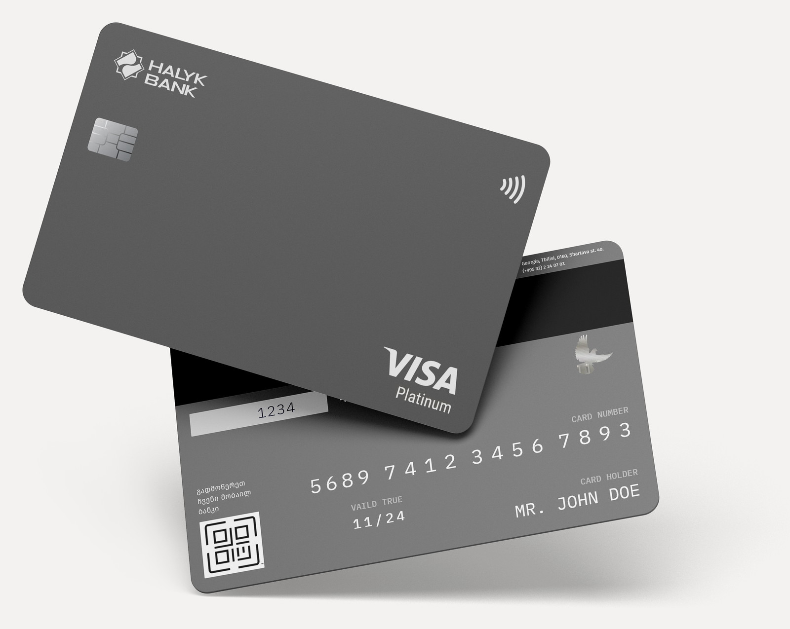
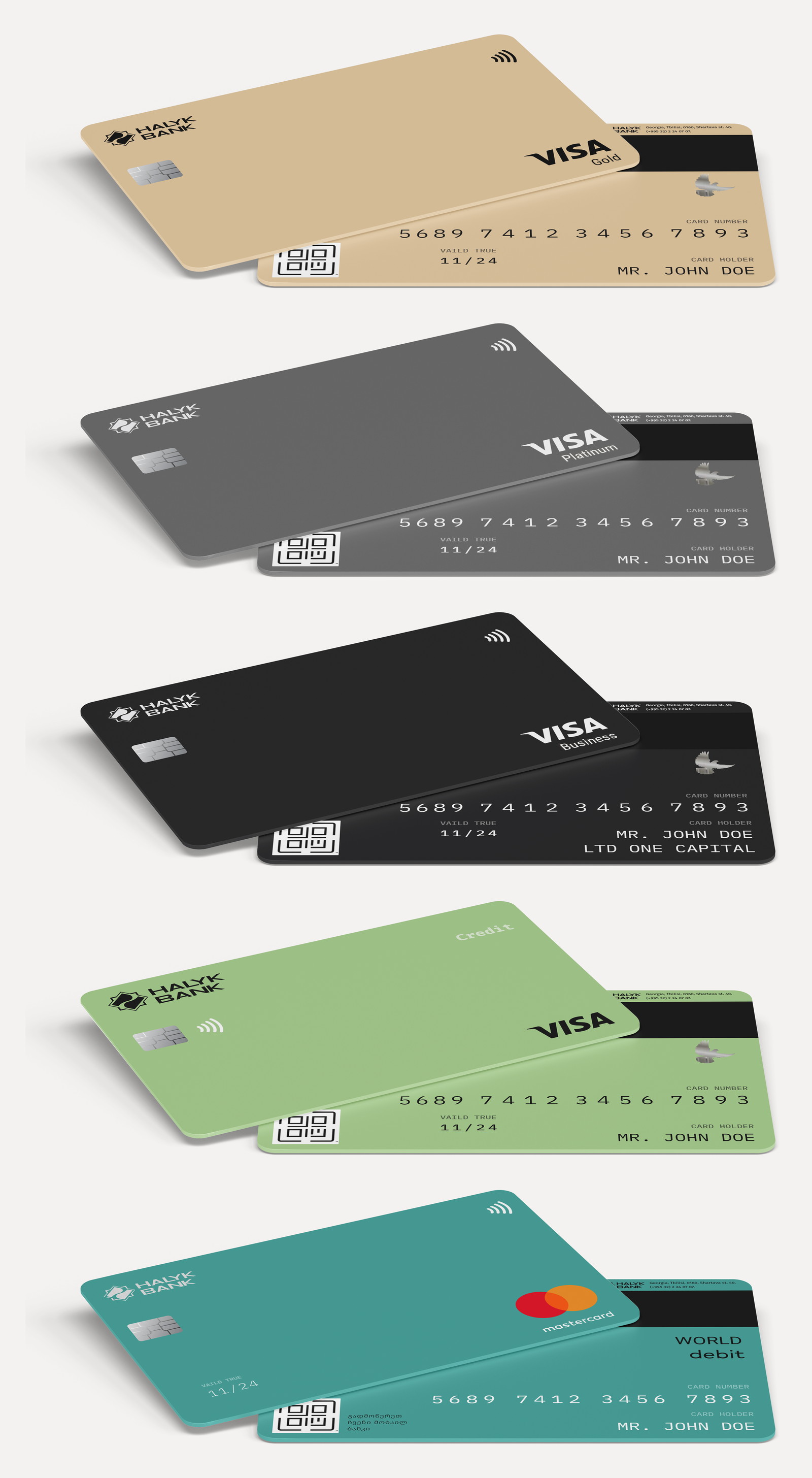
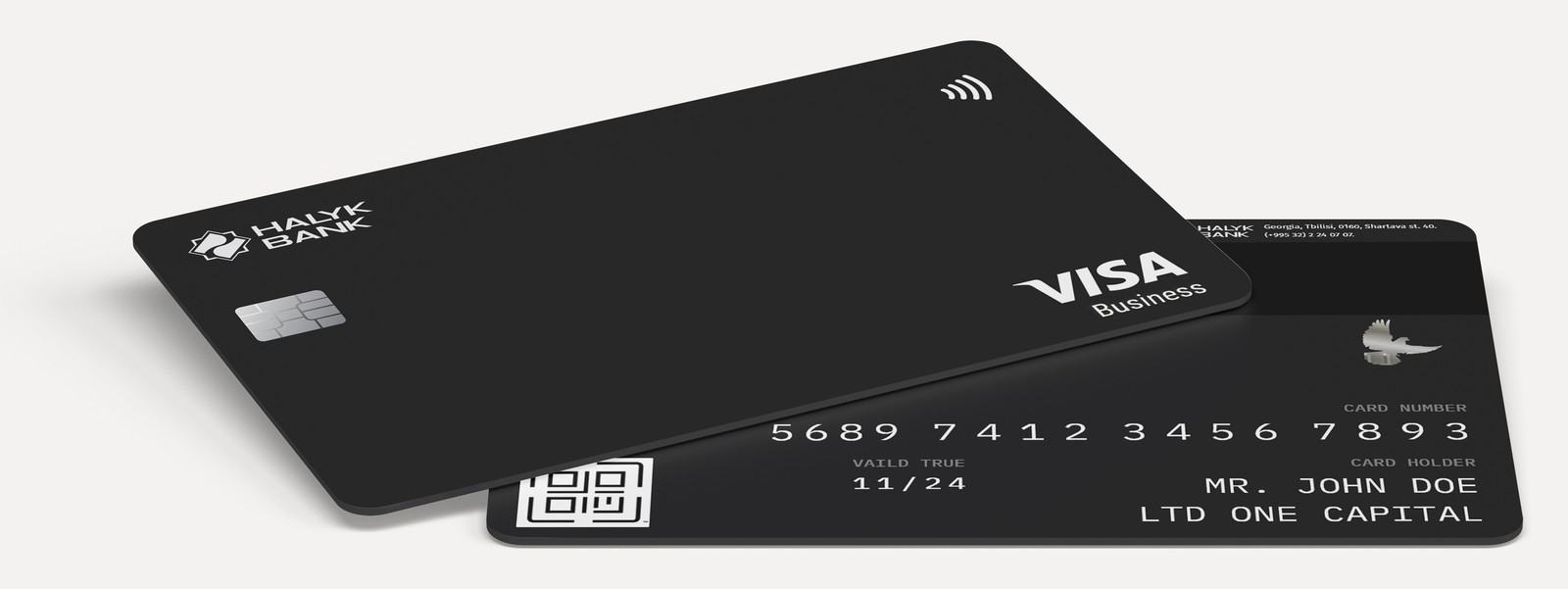
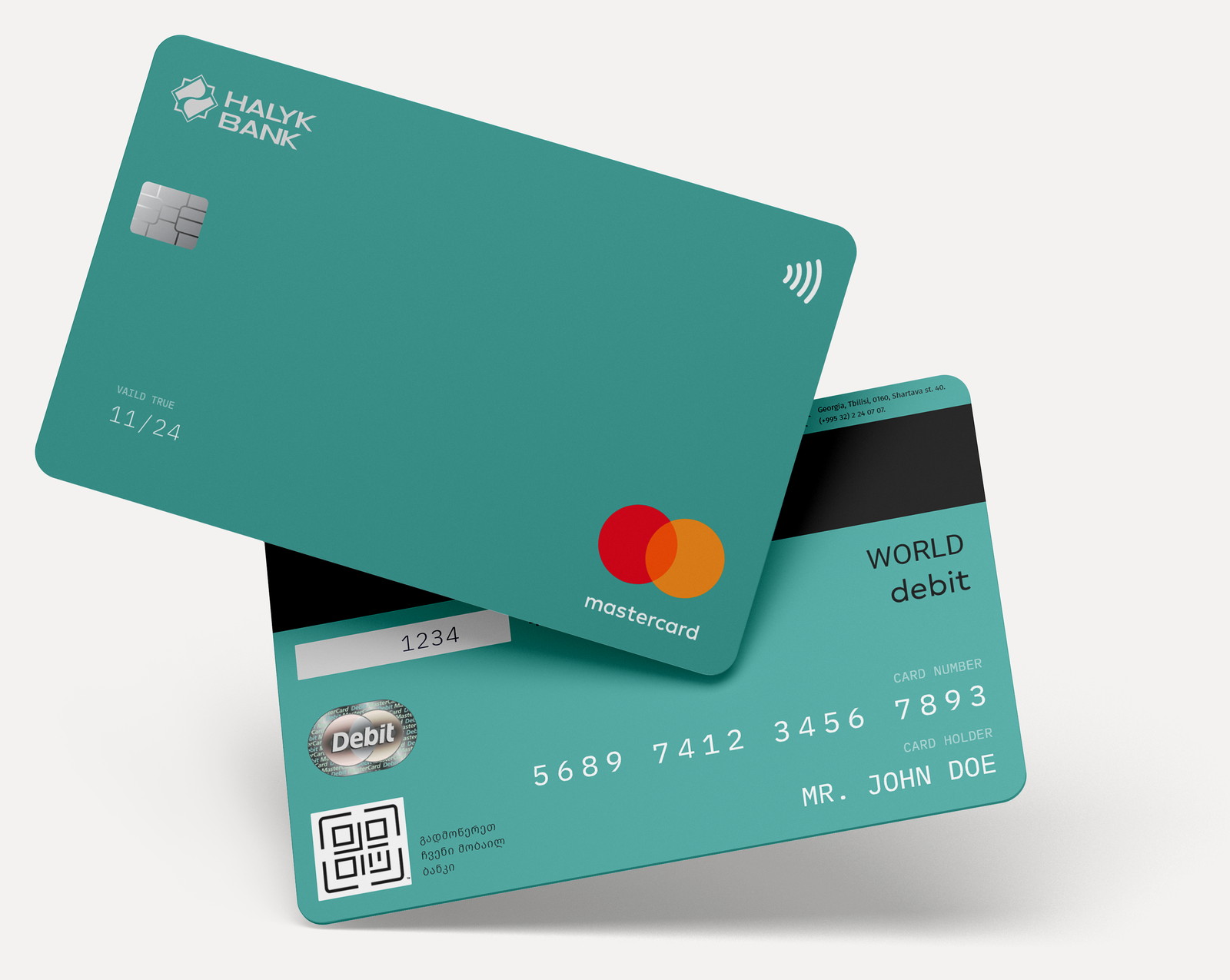
Every card in the range shares an identical face: logo top-left, chip and contactless below it, network mark bottom-right, and the tier word in the opposite corner where nothing else competes with it. Change the colour and you have changed the product.
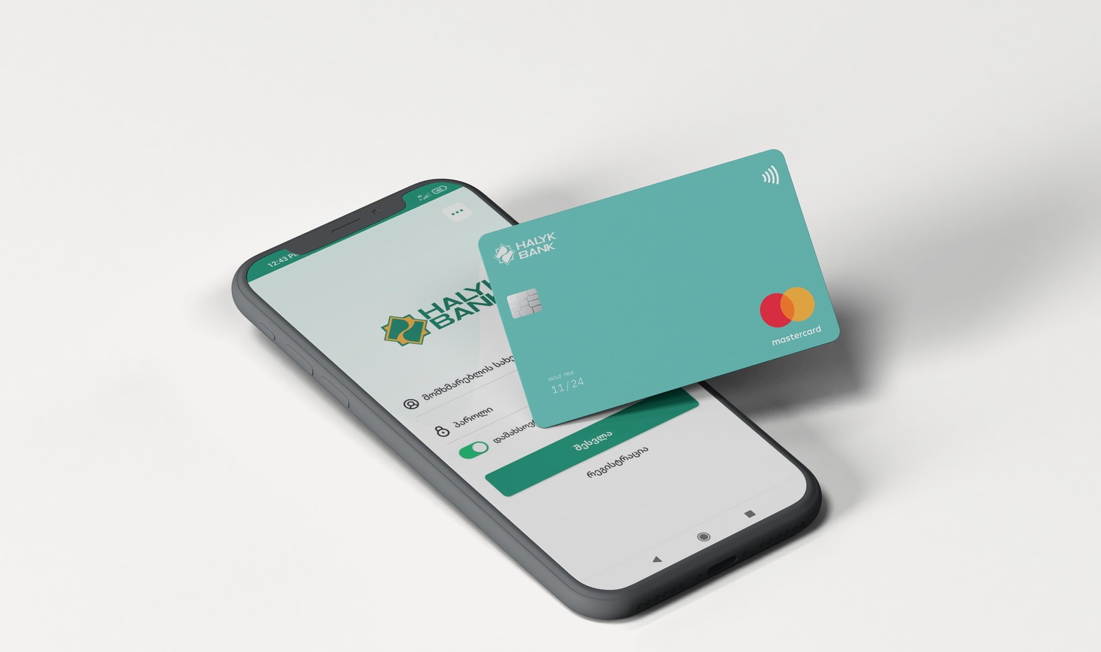
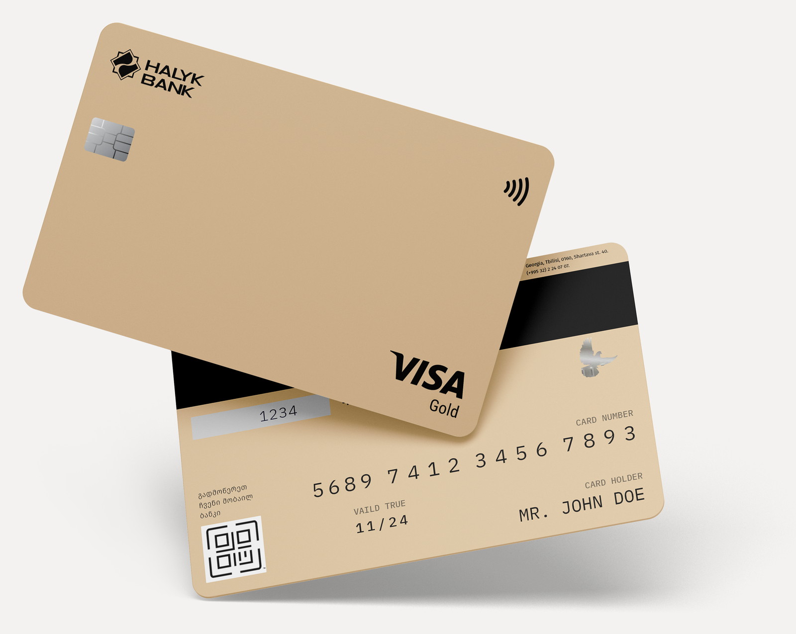
The palette moves through the range rather than decorating it — sage for credit, the brand’s teal for everyday debit, beige for gold, graphite for platinum and black for business. Nothing is metallic or gradient: flat colour prints predictably and ages better than an effect.
The tier is a colour, not a badge
Beige, graphite, black, sage and teal — one flat field each.
A customer holding two Halyk cards should be able to tell them apart in a wallet, in the dark, by edge alone. Colour does that at a distance no typography can reach.
Flat rather than metallic was a production decision as much as an aesthetic one. Foils and gradients shift between print runs and scuff visibly within months; a solid field looks the same on the day it is issued and two years later.
An empty face is a decision, not a shortage
Logo, chip, contactless, network mark, one word. Nothing else.
The temptation on a card is to add a pattern to justify the design. Every element added is one more thing competing at the moment the card is read, which is a second at a counter.
The tier word sits in the corner diagonally opposite the logo, so the two things that matter occupy the two positions the eye reaches first and last, with nothing in between.
The numbers moved to the back
Front kept clean; card number, holder and expiry printed on the reverse.
Putting the number on the back keeps the face uncluttered and makes the card marginally harder to read over a shoulder or in a photograph — a small, real privacy gain that costs nothing.
The printed data uses a mono-spaced face so digits stay evenly spaced and legible in a mediocre print at a bad angle, which is how these are actually read.
A QR code that does one job
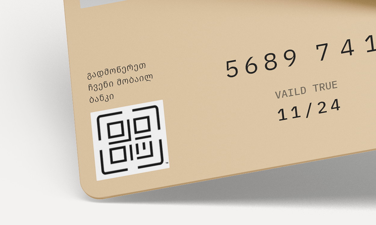
გადმოწერეთ ჩვენი მობაილ ბანკი — download our mobile bank.
The one piece of real estate a bank never uses is the back of its own card. A QR code with a line of Georgian beside it turns three years in a wallet into a standing invitation to install the app.
It is deliberately the only call to action anywhere on the card. A second one would make the back look like an advert, and a card that looks like an advert gets used less.
Georgian first, on a Kazakh bank’s card
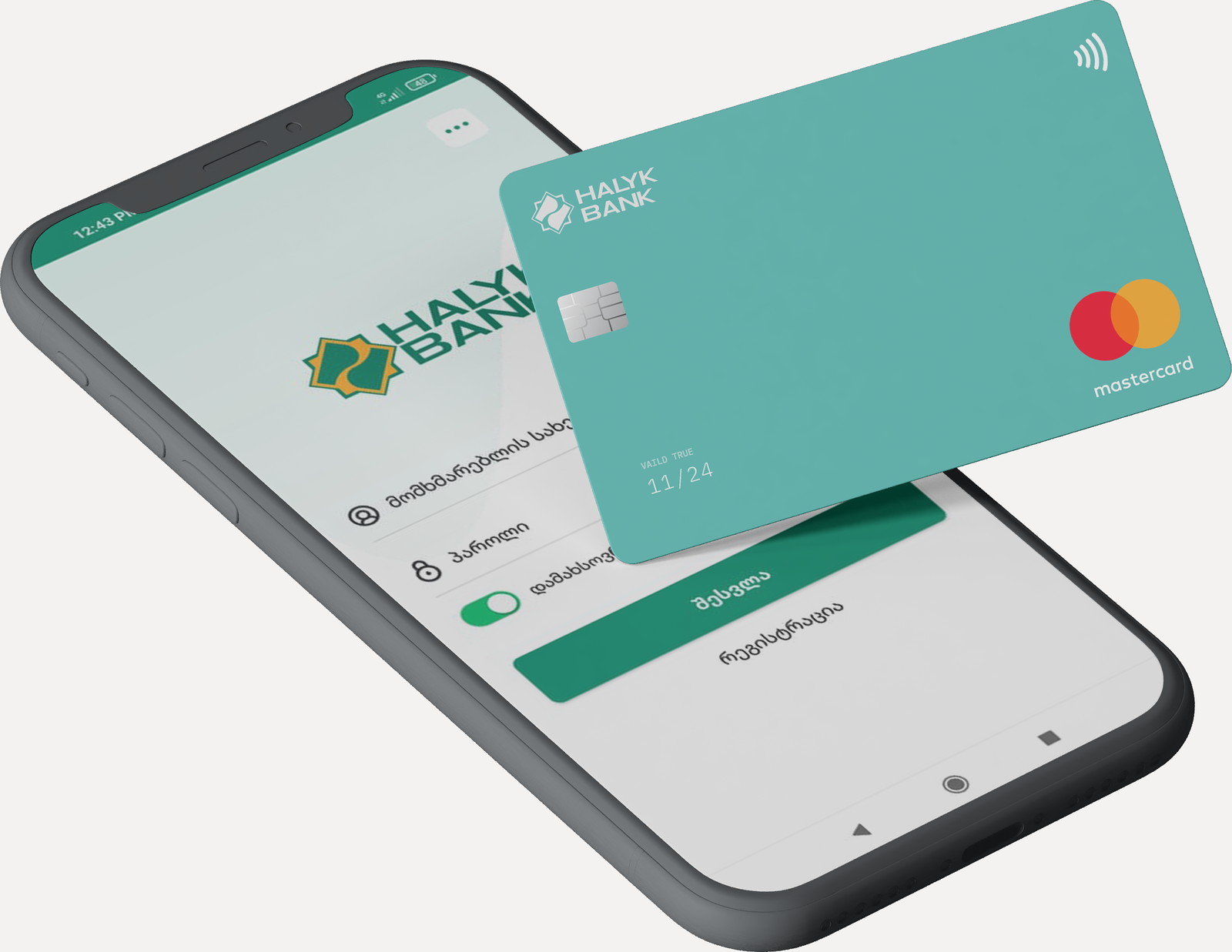
Georgian type on the reverse, and a Georgian app at the end of the QR.
Halyk is a Kazakh bank operating in Georgia, and the card is the most tangible proof of whether that is a local branch or a foreign object. The reverse is set in Georgian, and the QR beside it lands in an app that is also in Georgian — so the chain from wallet to phone never switches language.
The Georgian script also had to sit comfortably beside a Latin logotype and a network mark — which is a type-pairing problem more than a layout one, and the reason the local line is set small and quiet rather than translated into a slogan.
A range that reads as one bank.
The family covers Visa Credit, Visa Gold, Visa Platinum, Visa Business and Mastercard World Debit under a single layout, so a new product is a colour and a word rather than a new design.
Because the face is almost empty, the constraint that usually breaks card design — network placement rules, chip position, print tolerances — stopped being something to work around and became the layout itself.
What I would keep from this one
This is the most constrained brief I have worked on and the one where restraint paid the most. There is nowhere to hide on a card: no scroll, no state, no second screen — every decision is visible at once, forever.
The thing I would argue for again is the QR on the back. It is the only element that does work for the bank after issue, and it survived because it was the only one asking for attention.